What can I
do right now to this logo to be accepted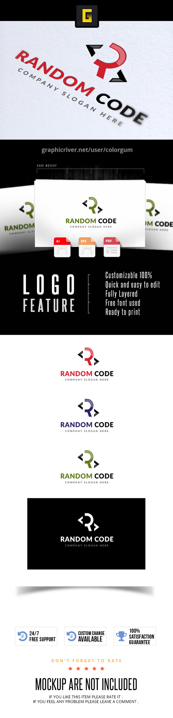
hi u can start with trying to make sure that u are combining a bit more complementary colors , theme colors or shades of the same colors , and also try to make the presentation a bit more attractive , a bit more readable and to give it a bit more breathing, because at this stage , the presentation is rather complex but also fails to really value completely the product as regard to what i have detailed. Otherwise to get a bit more in the technical part indeed, well , i think that the asymmetrical side of the logo tends to introduce some misbalance and kills a bit the harmony. The logo is also still a bit simple and easy to redo rather easily and quickly , which is a ruining the commercial potential of it , so this may lead the reviewer to bin the item … the imbrication of the illustration and text is not the right one completely , u should make then draw a little bit closer , they would thus look more connected indeed. The typo is clean but also rather flat and it seems to me that the tagline is a bit thin all the same and a bit lacking some impact (maybe with boldness). As for th central “R” i would reproach a bit the same , that is to say that it looks not outstanding enough , needs more impact …
1 Like
Thank you so much 
u are welcome, good work and good luck
1 Like