Hi
It’s the 2nd time I rejevted by graphicriver.
Can any one help me. I din’t know the reason
Thanks
Hi
It’s the 2nd time I rejevted by graphicriver.
Can any one help me. I din’t know the reason
Thanks
Sorry it’s rejected not rejevted
please add demo preview image format .jpg because we can help you thanks.
And the main file has no image
thanks
you design is too basic bad colors, error typography, not like shadow, etc etc but you need practice more for approved graphicriver regards.
JeriTeam
Thanks for your support. If I use gradient color and shadow in my design how it looks.
With respect the colours are only a part of your issues - there are numerous fundamental issues like alignment, spacing, hierarchy, typography, construct etc.
Just some examples:
the hero text to the left at the top is not properly aligned
likewise the logo bottom right as odd spacing and alignment
typography could be improved with better font combinations and stronger hierarchy
as you mentioned the colours should be improved
the construct needs work. Right now it feels like you had a list of features to include and just added them until all were on the page, rather than combining them or laying them out with a proper purpose in mind
This is also an absurdly crowded category which requires notable originality and pixel perfect design.
hi as mentioned by Charlie u have a whole lot of work ahead in about almost everything indeed … what i would personally recommend this far that u spend some time to learn more about basic design principles, tools and so on , that u see a whole lot of tutorials , too
basically u have some big issues as regard to the typo, too simple, not combining enough fonts and also and most importantly not enabling people to have a good readability of the flyer
u are violating a basic design principle as your item is made of text that are not only not popping out but which are hard to read since their color are too close from one the one of the background
besides learning about complementary colors and and how to combine them would be welcome too, i recommend that u go through youtube videos or take a course n something like Shaw Academy for instance , u will learn much for all these issues
the blue in the logo is coming out of the blue and clearly is not a good idea to match with the red version …
your dividers or underlinings, i am not sure what this is are completely lacking finesse and make the document look unprofessional s such
the icons u use are presets from photoshop and this would be very unlikely that u can make it with too simple and not that good looking things like this …
u are violating another basic design principle as well when u have a big organization and spacing issue join the top left part of the flyer …
Hi There:
You need more time practice more for professional flyer because you flyer is too basic.
Regards.
JeriTeam
Sorry for disturbing you again, can you see the attached and give some feedback
Thanks

Please see the attached and give some feedback for that flyer
Thanks
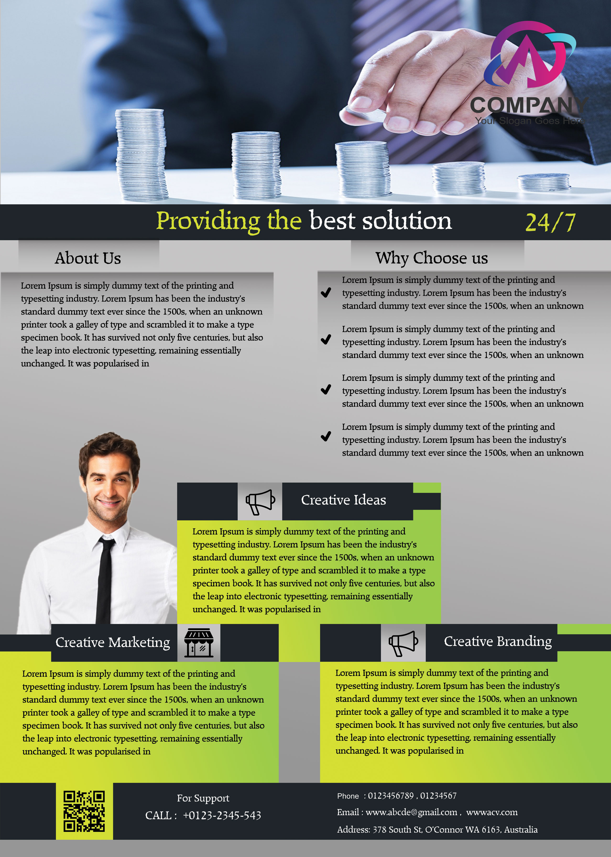
Sorry but you are still a long way off the mark
Design basics are still an issue esp typography, margins, hierarchy and spacing
Eg
Blue bullets are far too big
The off centre headings at the bottom don’t work
The QR code has zero padding or margins
Colour scheme doesn’t help
Generally font choices, typographic hierarchy and line height all need work
Thanks for the feedback
hi pls do not tale it personally but this flyer is probably one of the ver worst things i have ever seen in the corporate category … there are some issues about spacing every where , texts are spread out randomly and same goes with the rectangles under … some texts are hardly readable and lack of contrast with the background, titles cannot be identified as such and for the red one texts are invisible plus the colors are not even looking good in the context
i see no relation between texts and the picture on top …
the guy looks like pasted out there , and coming out of the blue …
the logo is lost in the image , icons and squares under are placed randomly and unevenly from one big rentable to the other and some icons - which are not truly outstanding or original in addition - are repeating without anyone can understand why …
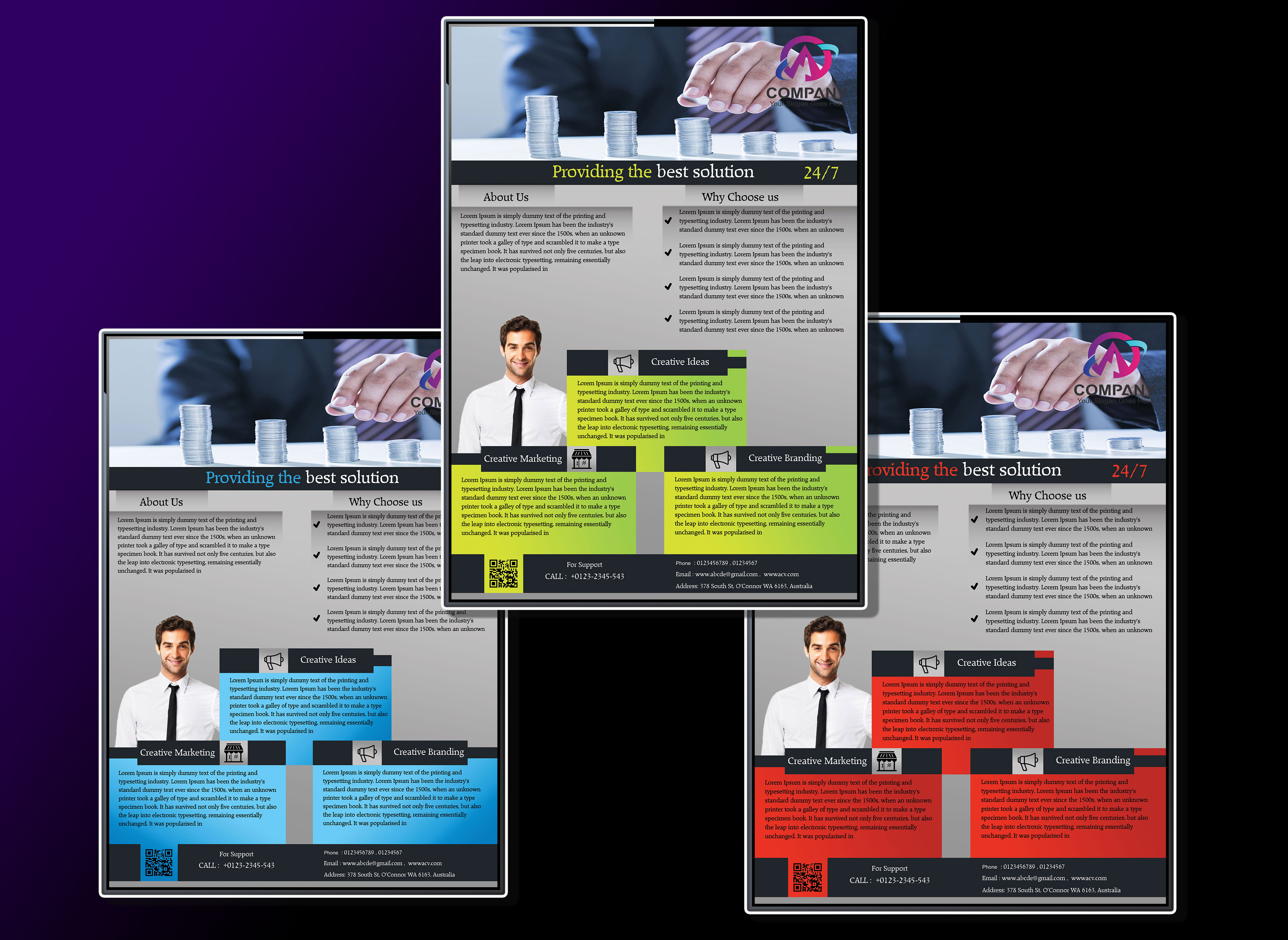
LOL if so u should have a look at the one upper … at least the last one is not collecting mistakes from everywhere like the other one and is “still harmonious”
hi for the grey and blue flyer, indeed, this is much better than the other one, though there is much to do as regard to the typo , which is way too flat and brings u to mess with the hierarchy of information too
the block of text “about us” is definitely too much looking like a block … decrease the number of lines and increase the spacing between letters and from one line to the other
put the qr code in white or change the square under to turn it white …
find a way to make the fake logo stand out more
use icons a bit more worked out if possible
pls globally use a sans serif main typo … like this the thing looks old fashion …
Thanks for your reply and I want to improve my work. So please see the attached file. I am eagerly waiting for your reply.
Thanks & Regards
Now yes very better but you wait other author @n2n44 he know more that i maybe give you good advices.
good luck.
regards.
JeriTeam