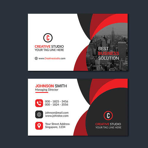
Hey Guys, I’ve created this CMYK, print-ready business card template for submitting in graphicriver. Help me to find out mistakes that I have made with your expert opinion. Is there anything I need improve?
You missed the most important thing – THE CONCEPT –
please can you explain more?
When you start creating something, anything you need a concept. A good concept is a result of documentation, functionality, design rules and principles and creativity?
Ask yourself: For what type of business is this card? What industry? What is my target? What my competitors does? After you will find answers to these questions start creating graphic elements that support and goes well along with your answers.
If you skip these steps you will end up combining some arbitrary elements without any sense like you just did.
hi indeed, Designsomething actually stressed very important things indeed and he is completely right all the way. I would like u to figure out that what could have been possible a long while ago, seems to be very complicated to say the least nowadays. Bringing very generic thing to the table could probably be useful in the past and certainly brought a larger audience i guessed but i think that nowadays this is the other way aorund, with the degree of saturation that the market has been through. Indeed, these times have ended as a lot of cards of all sorts have already been created and u are most importantly expected to bring something new to the table. U will be more likely to be able to have stuffs accepted, that they sell and to get gains as soon as u have a true concept and try to avoid to make your creations look like thousands of others. Unfortunately , this is what u have here. Disposition, shapes, colors, typo, everything inspires deja vu rather than any other thing indeed. Not to mention that, apart from this , there are a good deal of things to add about what u have here , that could be improved, should be changed, or which is sort of troublemaking.
let’s start things of
1- general style
i guess i have treated this point in the introduction, anyway , what i would like to add is that apart form the strong concept being required, pushing the envelope graphic design wise is not a bad idea in an attempt to have the final product looking more original in the end
2- global harmony
this is rather nice about it , honestly , but i think that the choice of the logo is definitely the right one … this makes u end up mixing very “straight” shapes with very circular one, which is not a good idea, most of the times, in terms of harmony … a bit hard also to identify where the single grey bullet is coming from as there is no echo whatsoever in the card and this is thus not a good choice
3- icons
well they are overseen to tell u how i feel , lookalike photoshop presets like this are not only having very little impact visually speaking and graphic wise, but, on top of this, they are even more bringing u to sort of a global flatness indeed
4- organization
indeed, the strange thing is that both side have the same organization but texts are flagged differently … one on the left and the other one in the middle, which makes very little sense indeed
5- hierarchy of information
the card is rather weak about it, since there is very little discrepancy between main titles , logos and so on and the additional data, there is sort of linear arrangement at this time , when it would be more welcome to have web defined primary and secondary levels indeed
6- alignment
look, this is a template, u need to make sure that all is properly aligned in any event and u can even adapt the content for this … “best business solution” and the website are not aligned and same goes with the logo and data the other side, i think that would be better to align both vertically with blocks on the left
7- typo
this is clean but flat and this contributes to make your item look “overseen” or flat. Introducing variations, font combinations and touches or originality in the choice of font would help u to improve the typo and definitely have a better impact for the different texts
8- additional detail
quite frankly the bicolor qr code, i find this really cheap looking indeed , i believe this is really not a good idea
Thanks for suggestion.
Taking your suggestion I’ve modified this business card. please can you take another look and review it? I’m ready to work on this card another 100 times. I just need the right direction. which you guys are providing. @n2n44
please can you take another look? @DesignSomething
hi well i think that u rushed things up and did not really pay attention to what u were told , as there are tons of things lacking , not really being modified and so on , besides , i thin that u introduced additional contrast problems in the next version by adding the cityscape that makes the text above even harder to read in the end … most important;y again, to tell u the truth i believe that u have chosen the wrong option … the v / squared version was much much more interesting than the cuircular one that u opted for
but in any event, this doesn’t not deal with probably one of the main issues, even if u had fixed absolutely everything otherwise … this is the fact that u still do not really have a true concept for the card the v / squared version would have helped to bring something more worked out and original to the table but it would not really have dealt with the concept issue …

