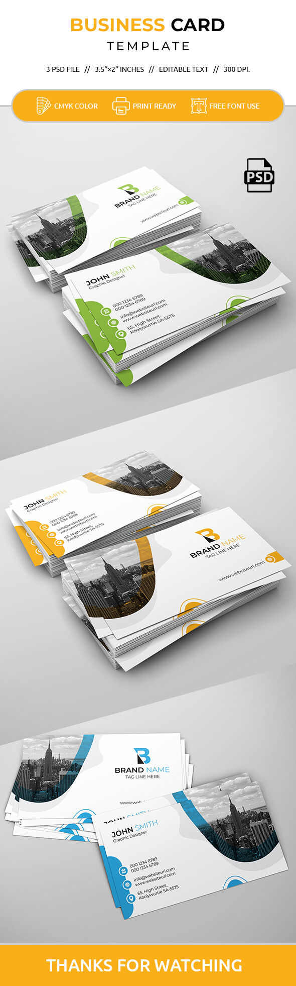
hi as for me, I tend to believe that part of the problems for almost all the things that u have showed here, this is that this is neither original nor completely well arranged all the way, as potential buyers maybe looking for such a type of item indeed. I particularly agree Designsomething, when he mentioned that u do not bring anything new to the table with any of these cards. The fact of the matter is that creativity is normally not the main point for a corporate product in the first place , people will be more likely to expect from u to have all professionally arranged instead, but , on the other hand, this is a marketplace and of course, with a reviewing , this is changing everything , so to speak. I assume that u can identify that if u come with all the same style, color associations, kind of images of used, typo and so on, u will have a good deal of trouble to, at the very least, give your item a fresh touch and differ from already a significant catalogue of products. Especially in this category , I might add, since many people try to get in this category. This is as far as originality / creativity goes
Now, more “technically speaking”, as I mentioned above, what u are expected to do is to make sure that absolutely everything is properly arranged, balanced, aligned and everything. Part of the difficult part is that u have to make sure that there is no flaw at all. The lucky part is that this is a template and u may choose to modulate the content so that u can more easily do so. Anyways, as showed by Charlie, the QR code is not aligned. Alignment is a basic design principle and needless to say that messing with it is a not a good idea, that’s the bottom line. The spacing needs more work too, the global vertical balance of the disposition of the content is not completely done well at this stage and there is a bit visual disharmony resulting from it here and there. I am also particularly wandering why placing name and function so very high on the “New York” card and leaving to much space under , leaving the personal information completely disconnected from name and function. U should realize that it makes very little sense … but brings trouble instead. I know that this is a “common practice” to use the very same color declinations for each card but, apart from not being original at all, honestly , this is a very inefficient practice in the end when u end up having contrast problems. Look, the green versions are very significant. U have the person’s name this is close to being unreadable and this breads a hierarchy issue … why apart from trying to the same as other people do, putting a different color in the name, it looks like they belong to two different categories of information , when they are not , this is both inefficient and incoherent in this case. The color issue is also well highlighted by the icons. Icons do not pop out, and this takes out the exposure out of it, and , in the meanwhile, this is contributing to flatten some of the graphic elements that are supposed to be valued so that u can say that u have brought some additional value … finally I may add that the urban cityscape , is not really original and in the case this looks really dark and for me this ruins the harmony of the rest of the card , as such