I need a feedback on my submission, that is the business card. I don’t know why graphicriver always reject my item. There’s 10 designs has been rejected since first time I uploaded a few months ago. Before I write here, I read almost all the tips for submitting business card item, watch a tutorials on youtube, etc. I’ve followed the instructions and that’s didn’t work. The reason why my item rejected is always same: “it isn’t at the quality standard required to move forward”
Here I attach some of my designs and just want to ask, is this not meet graphicriver’s standard? Do you have an advice?
hi u should post cards one by one this is not convenient nor easy to help u with such a collection like this … anyway …
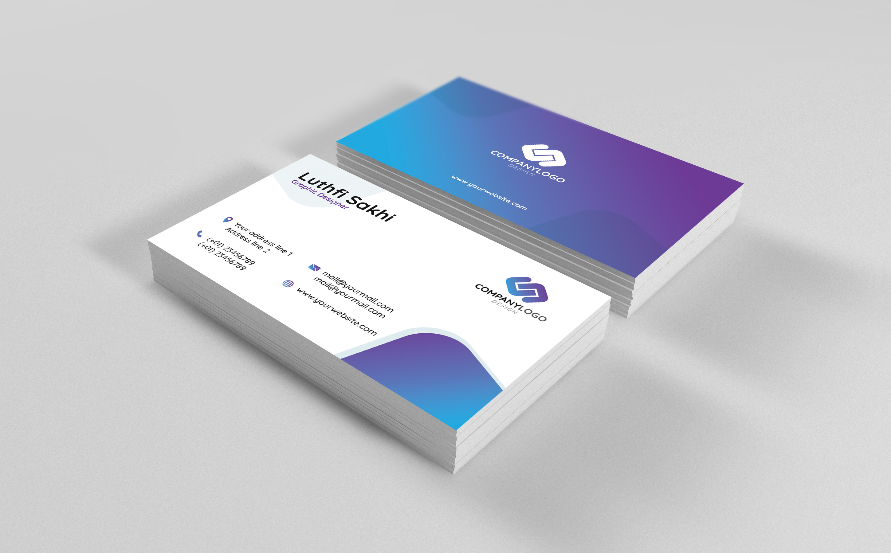
card 1
the style is very simple and quite in a deja vu style , not only about the lay out, the colors , kind of typo and icons … even the disposition … The icons are too simple, they look like photoshop presets and visually speaking, the side with the information is misbalanced in my view, much compact on the left part and way less in the right part , managing to find a better balance would be welcome. Have u heard about z-shape reading process? if so u would understand that either the qr code or the logo may not be placed in the best positon so tha they have an impact …
for the logo side, well this is really basic to say the least , this side almost brings nothing to the table either in terms of information and of visual impact / interest. Finally the typo is flat for here …
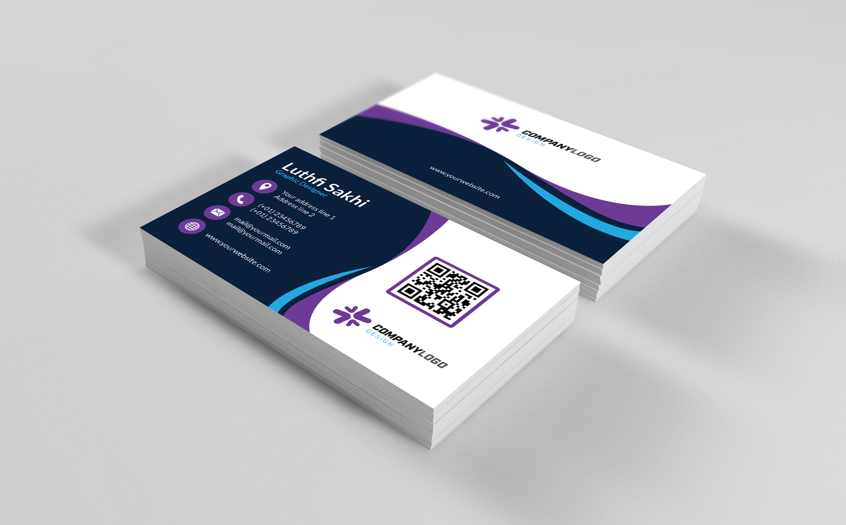
card 2
the harmony is better there is a bit more originality as well but globally i think that pushing the envelope somehow some way would give more commercial potential and interest to your card as this is quite easy to redo it in a short while so why would anyone choose to buy if it were accepted rather redoing by themselves and saving money … in addition , the information side is far from being irreproachable … the typo is very flat , this is lacking variations, font combinations etc … the name and function are not valued enough and are even harder to read after u put a shape behind. The global organization is bringing a natural visual misbalance. icons are not bringing anything to te table , too
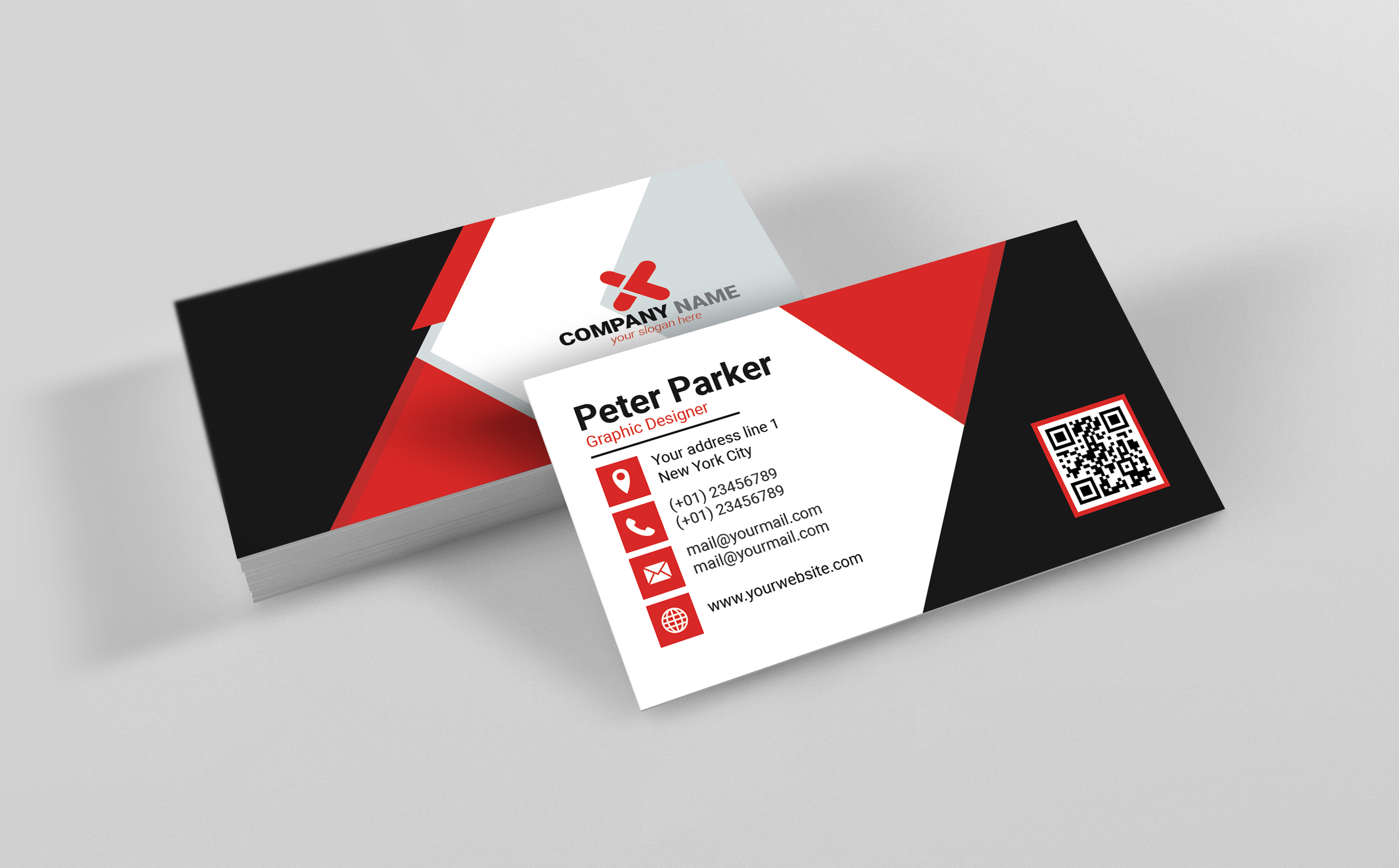
card 3
the style is overly seen everywhere ,they must have hundreds of this and in such a saturated place , in such a crammed category your main focus should be about bringing something new to the table. Icons are once again too flat and turn out to be visually uninteresting even if this time u could manage to value the rather we’ll the fake logo is much better also but too bad u did not find a wa to connect it with the rest of the design … otherwise the typo in a general way is too flat and not consistent for a place like GR where this is probably the main focus of all …
card 4
i like the harmony that u generated but honestly u need to find a way to introduce some more originality all the same. for the information side , icons are too basic and visually flat , u have spacing issues for the data lines , u should introduce more space between the lines so that they are more readable , that this is breathing much more and ti finally arrange the space in a much better way , too … as the name and function look like a block with the rest , everything is too compact , plus, u have a hierarchy of information issue, the function being relegated to sort of vague secondary information , when this is not
Thank you for this feedback, this is my first time posting a topic in this forum, so my apologize if I shouldn’t sent all the files at one time. I think yes, I should improve the quality of the design as what you wrote above. Before I upload the submission, I just try to find a feedback from some graphic designers mate near me, and they say it should be accepted at GR. Once again, I would say a big thanks to you, hope I will accepted after this.

 if u have enough clues of what to do u can check the “solution” box , good work and good luck