was hard rejected for the reason “unfortunately, we found it isn’t at the quality standard required to move forward, and you won’t be able to re-submit this item again.” Whatever the articles mentioned in rejection emails I already tried to follow the same standard and design also I created them myself without any copy and they are unique.
It’s not good behavior for a beginner, you simply say “[GraphicRiver] Your item, Business Card has been rejected” you should tell about the reason why my item was Rejected, If you did not change your policy then lots of good talent will move to other platforms, I would suggest to you please gives the chance to solve the issue.
If I get an idea or proper reason for the improvement of my product I am definitely going with the suggestion but I am wondering where I have made mistakes in following the standard for quality.
I really appreciate you guys can share the suggestion and showing my mistakes to improve my further submission.
No one can give the exact reason for rejection! We only can point some common mistakes. As for Envato review rules they will not change it for you that’s for sure. Asking here for the exact reason and compare with other author items it’s useless. If you see your items keep getting rejected change your approach, try other categories.
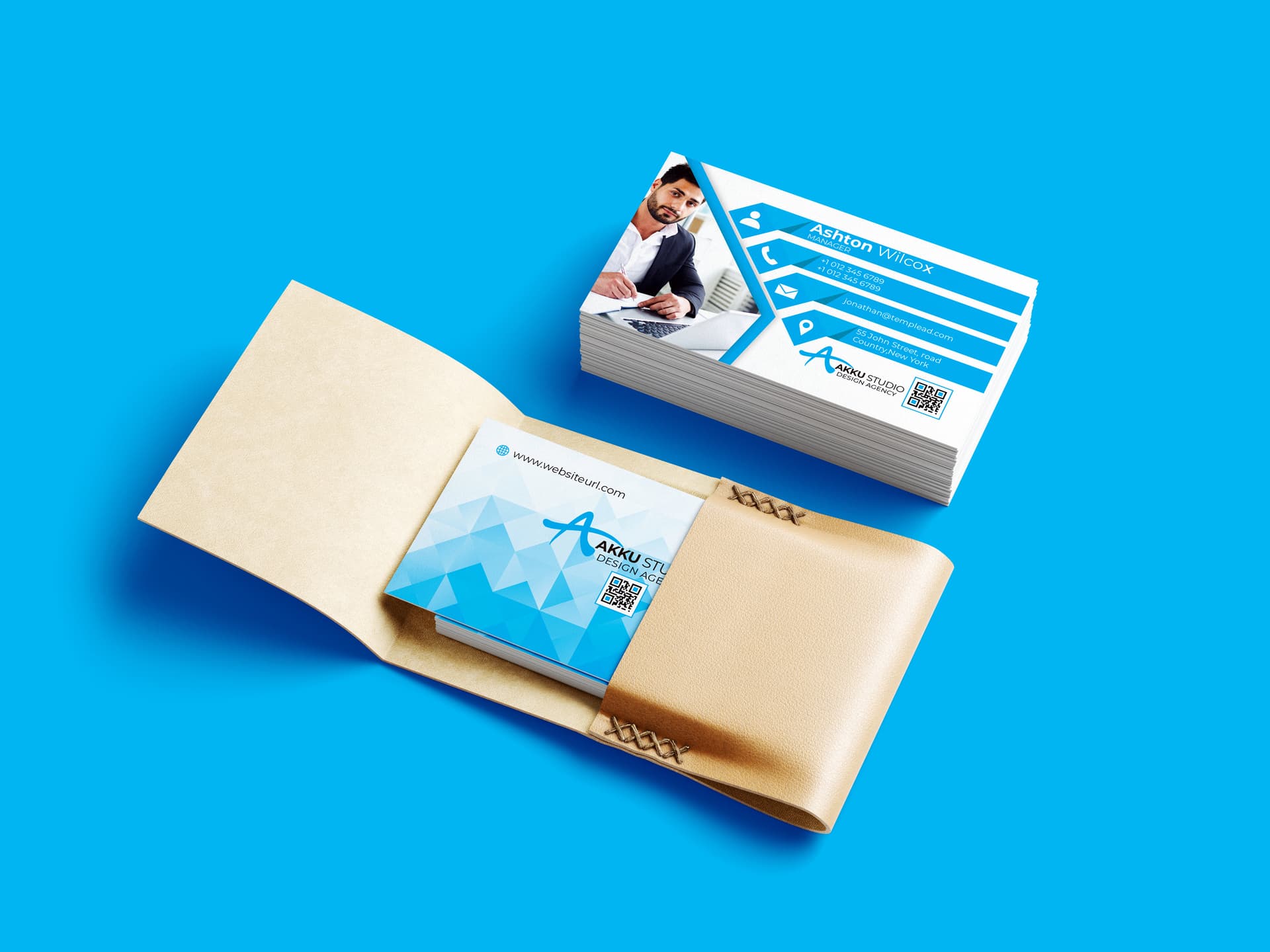
hi I personally believe that the main problem is here , that part of the content is not really original and that this is paired with a practical and pragmatic reason. Indeed, it seems to me that u are mistaken as regard to the purpose of the card and it looks like that the thing that u sell and value here is the card, what I can understand as a creator’s point of view, but which makes far less sense, if u stand from a buyer’s point of view … look, the text looks very small and I assume that information will be close to invisible , for different reasons , starting with the size. Then, come the lack of contrast of the white color of this blue and that prevents people from enjoying a readability and also to have an efficiency of the product indeed. After all what is the point to have a card if the information on top of it cannot be read? This contrast thing is not a small deal as we are talking about a basic design principle here. Apart form this, the logo in the personal information side is not placed properly, too close from the rest of texts and this is parasitizing so to speak, not to mention that this positioning does not allow the logo to breath and get the right exposure, as well … the QR code is also too close from the edges if u ask me and I really fail to understand why the last name on the card is so very thin that it doesn’t belong the same hierarchy level and thus fails to be as visible as the first name , which looks not more important than the last name …