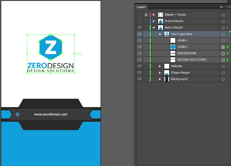
Here is the new business card template I have upload, looking forward to your comments. Thanks all !


Here is the new business card template I have upload, looking forward to your comments. Thanks all !
It is exactly as logo title say. Zero design. Zero Concept. Totally outdated style. %0 chances for approval.
I wouldn’t buy it because many similar products are now freely available on the internet.
Nice job, I hope approved graphicriver, regards.
@jeriteam007 Please tell us what is nice in your opinion. Maybe I didn’t see the nice part.
I think that your business is good but I like this but I am not expert designer.
I never sell business card in graphicriver.
hi buddy, i am sorry to tell u just that but all this is really overly used … colors, shapes , organization, typo, we have seen it all times and times again … not to mention that unlike what happens with some others, indeed, yours is not offering as much finition and being coming after , which means that people paved the way for u indeed , so reviewers should expect more from u than less … what @DesignSomething mentioned is exact … the issue that u have above all is that there is not concept and that the market is not the same as it used to be years ago where generic things could help to sell a lot … today , with the saturation this is the other way around unlike, u give personalization to your card and u potentially hit a niche, then the thing is not going to do well anyway … . All this is about general thinkings and so on , but let’s face it, apart from this , u have a collection of issues to fix and things to modify, change, edit, and so on … one of the main point is that u have been using some color variations for the preview that do not make any favor to u and your work , as the concerned tries made u violate the contrast basic design principle. This is probably the worst of all to break this one … this is leading u in a snowball effect to face further problems about readability, hierarchy and so on …
in addition, the fake logo , is really really super flat … this does not loo professional and or visually attractive and i suggest that u invest some time to create something that is really looking fair enough so that the logo takes your preview to the next stage rather than emphasizing the lack of creativity and contributes to make the design look flat …
the typo part is also quite flat and this would take more variations, font combinations and a few touches of originality to give more relief to the concerned part … pls keep in mind that here typo is not a small deal and that this is probably the prominent issue … standards are high about it …
the logo side is also really super empty and this worth wandering if this is really a need to bother creating a “b-side” if the thing is so very empty like this , in particular with such a very flat and plain looking logo as the one that u have until now …
pls also forget about the color in the qr code … this looks like a trick for guys who do not know what to do with their design to make it look a bit more worked out, but this looks most importantly really super awkward and definitely no aesthetic …
pls also balance the data side … the lower part is super crammed, there is not breathing, the spacing is not the right one and the global content is not well positioned …
Thank you Guys for taking your time to view and give feedback on my design. I think those are great feedback and it will help me improve my design in the future. Thank you so much Guys !
