Can you Please tell me what should i do to get approved. I submitted many times but they always reject item .
Please give tips and suggestions to improve design.
Can you Please tell me what should i do to get approved. I submitted many times but they always reject item .
Please give tips and suggestions to improve design.
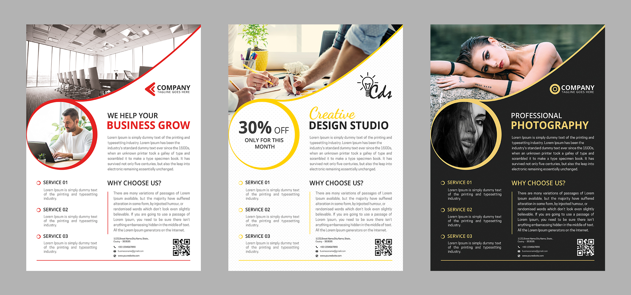
hi in a general way there is much to fix before there is a chance to be approved indeed …
1- typo
this is too flat, not original enough , combining fonts enough
2- general balance
this is “crammed” in general way , u definitely need to introduce some breathing and white spaces so that blocks do not look like blocks anymore and that the reading is made easier
3- readability and hierarchy
this is resulting partly from the previous point, but globally the texts u have put here are neither outstanding nor really readable and this is really difficult to get into this document and feel like reading it at this stage and as such
4- colors and contrast
indeed, t7his is mainly true for the yellow one, but indeed, the colors is not properly chosen for this one and there is an obvious lack of contrast ending up in giving people a hard time t read what is written , actually …
5- lack of graphic design
to be honest if u ask me this is definitely lacking a bit of a personal touch and of graphic design in a general way … the whole graphic part is kind of consisting in the picture and a circle with another picture inside … and apart from the deja vu feeling resulting from this , i think that this is definitely decreasing the commercial potential of what u have done …
6- footer
make sure to give more space to the footer and to take it a bit more away from the bottom line …