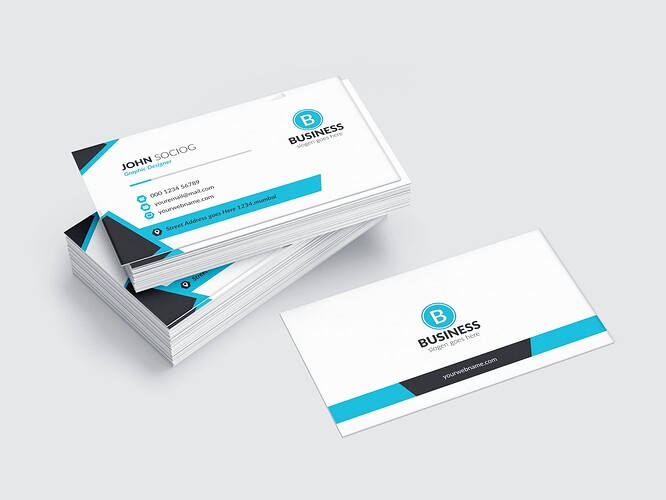
I don’t know how and why my design is rejected anyone can help me and tell what’s the mistake in my design.
hi this is tasteful but clearly too simple indeed … look, this can of thing can actually be downloaded for free from the internet … u need to add extra value … not to mention that this is tasteful but flat. Let’s face it , when u analyze what’s left when u take out the logo, there is basically nothing in terms of graphic design. just a few plain color shapes, a few simple icons, some texts … by the way , there are issues with coherence and the hierarchy of information …Why is the last name not at the same level as the first one ? is there anything to justify just this? besides, what is more important the first name or the last one according to u? the function is basically relegated to sort of a tertiary level … as this is small, not contrasting and a bit stuck too so that this is choking and clearly not valued or even readable I might add …

