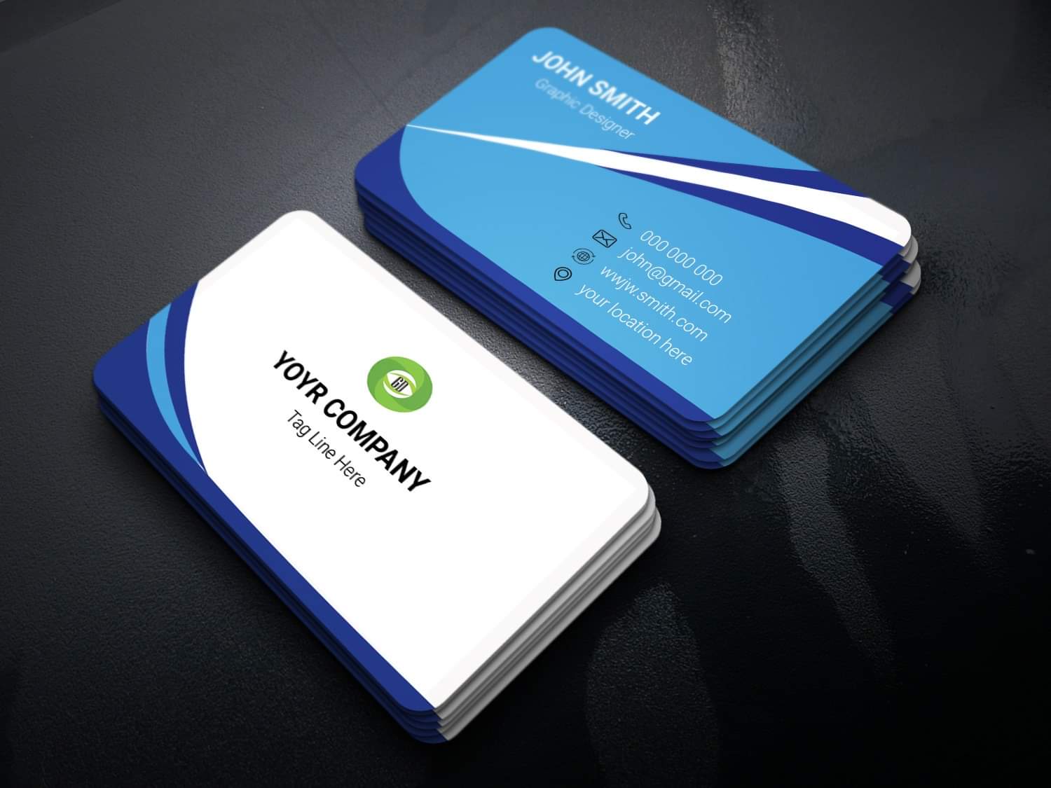
hi indeed there is a collection f very good of reasons to reject this card …
1- contrast
some texts are hardly readable and they turn out to be personal information so in other words, as such the card is useless … texts are not popping out …
2- hierarchy
as mentioned above there is almost nothing that catches the attention in terms of texts …
3- readability
once again this is linked to the contrast thing … if u have a BG and a text on top of it and that the colors are too close , u cannot see anything … or this is hard to read and this is what u have at this stage
4- mispelling
this is not an important case but the misspelling in “your” is just giving people the feeling that u did not pay enough attention to your design and will definitely help the reviewer to take the decision to reject your item if this is not “perfect” elsewhere …
5- colors or colors combinations …
hard to understand where the black and green are coming from … too many strange colors
6- fake logo
sorry to say just this but your fake logo appears as a “joke” , no one "can buy it " this is not only failing to be aesthetic or making any kind of sense but this is bringing a “disharmonious touch” to your card design
7- shapes and coherence
how to understand very straight lines in one side and very curvy ones in the other side?! are both sides supposed to be disconnected?!
8- icons
they re too flat they bring nothing to the table and as such they are hardly visible …
9- emptiness and too minimalistic style …
let’s face it there is almost no graphic design here … this is super flat and the side with the logo is super empty … people would ask themselves what they would be supposed to pay for cf nº10
10 - commercial potential close to 0
the card and style are not original at all and in addition this could be redone by a pro designer in not over 10 minutes … so why would they buy it ?!