Dear @n2n44 and @All Please Say Me Is’t it a Quality full/ Standard Design??? I Check and Double Check
1.main file(Font+Alainment + Size of text+ File Format+Version)
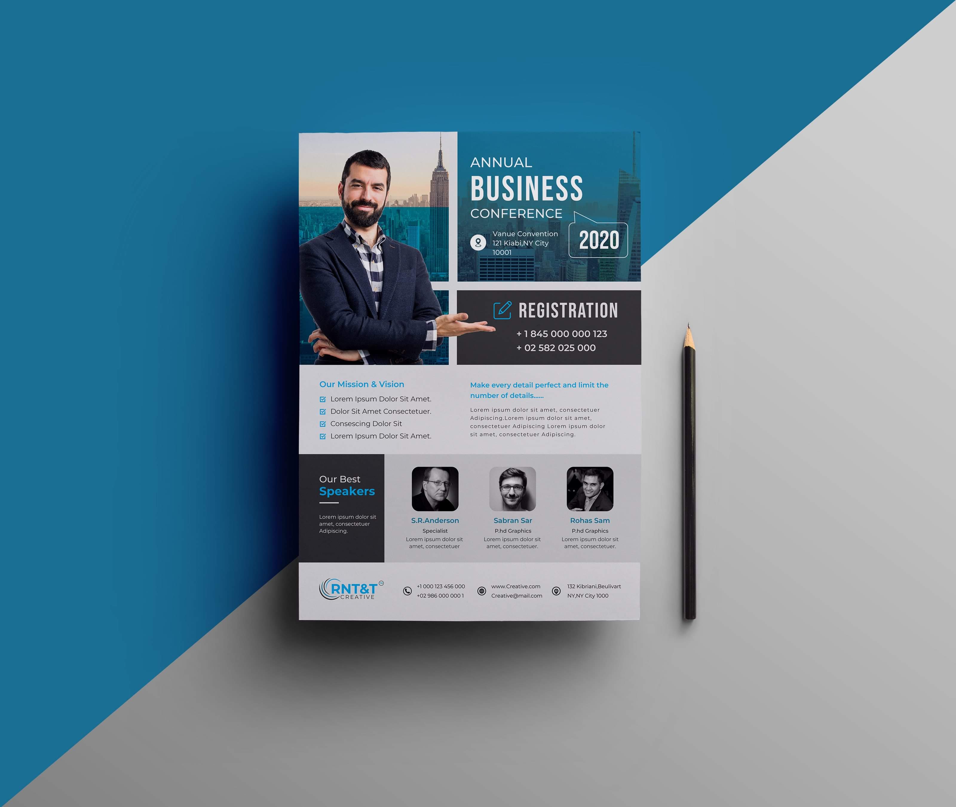
2.Preview Image+Thumbnail+Screenshot All I Setup perfectly as The Role Of Graphic river.
I also Use Black Image In Clippingmask Option…
Then Why This Design Rejected??? Please Late me know!!!
The first one is simply that the address text in the top section is hard to read on that background.
The second is your use of images. I really like how you have the guy pop out and overlap different sections, and I especially like how he’s gesturing to the registration section. However, while it looks great, that could be a big problem. Who is that guy? And do you have legal rights to include him in the item that the buyer actually gets? What if the buyer wants one of their own people there? That would require some special effort on their part to not only carefully cut out their person, but they would also need to make sure to get their pose in the right position, since the registration layout takes his hand into consideration.
Overall I like it, and I think any client would be happy to have this, but as a marketable item for a large and diverse audience, it might not work so well. I honestly do think you have something good here, so I would say instead of trying to sell it on a digital marketplace, try contacting companies, conference planners, etc. and see if you can sell a custom made version of it to them. You might even make more money doing that than you would on a marketplace where you’d only make $5 or $6 per sale.
As a quick side note, I would put both a phone number, and an email address in the registration area.
LOL and how much would he get out of trying to make such a huge work buddy? lol and what is the purpose of a digital market if not to have to handle commercial search of customers? and why would the ting sell directly and not here … how could a flyer be attractive for customers directly and they would not be able to come here one way or another ? besides u think that people would pay much much more as a customized “but generically made item” when they could get a lower price of something a bit in the same style in a marketplace? as for me i do not believe so …
as for the picture u are right this looks clearly like a commercial picture and no doubt in my mind that he should withdraw it to have the item accepted anyways …
hi unlike what @XioxGraphix mentioned, i do not think that the gesture of the guy is a problem for the flyer and that any other posture would be ok too, even if the picture may not give the same cool effect … after all people are free to choose if they want the same style and keep the same point effect or not …
however he was right about trying to make something that make more sense as regard to the organization of information , especially if u a are considering the z-shape reading that the eye does, in other words , the way your eye will sweep across the page while reading …
for me there is a collection of problems that @XioxGraphix did not mention indeed as there are important issues that were not mentioned though they are very likely tone a reason for the rejection …
contrast and readability
u are violating a basic design principle here … not only are texts not popping out much but they are even , for most of them hardly readable , since not contrasting enough from the background …
general style
this is indeed the part that i differ the most with what @XioxGraphix said indeed , i personally do not see a customized thing here but really a rather “usual marketplace item” in the style of many items that have already been created for the corporate flyer section … do not get me wrong what u have done is not but what i mean is that there is nothing revolutionary either in terms of novelty
hierarchy and placement
this is not a major mistake but a minor one, i think that the whole flyer is not super consistent all the way about the thing that u valued or not and the way the elements are placed , besides, for instance, if u introduce some guys are their names and the name is hard to read, what is the purpose in the end ?
alignment
nothing too much about this but quite frankly when having a look into deeper details , the part of the best speakers is not placed properly in the area … either u need to move the darker bloc under a bit more on the right and reposition vignettes accordingly or u need to arrange the text so that u have the same kind of space in both sides , since, at this stage , there is a choking effect resulting from how u placed things …
You realize the vast majority of businesses and companies aren’t aware of digital marketplaces for design templates and assets, right? I make between $200 - $800 for every “generic” brochure and flyer that I do for businesses.
Besides, this specific one was already rejected, so it’s already lost it’s ability to be sold on GraphicRiver. My main reasoning for saying that anyway was because this one would require extra work to customize properly, so just sell it to a business and charge for the customization, rather than just letting it sit as a useless/rejected file on their computer.
lol no doubt that your olsution maybe working, i am not questioning this, maybe i failed to express myself , buddy … though here is what i think, what some people can do, is also very difficult for some others … what u mentioned takes to invest a lot of time, to organize well and / or to have a network indeed …
so as u mentioned this is worth trying, though if the concerned person has a lot of time to invest and knows a bit how to handle so to speak …