My flyer getting rejected several time

hi basically this is rather clean but this is lacking creativity and font combinations (especially as any guys offer this type of item). you have many spacing issues, the typo is too flat and same goes with the used icons , not to mention that some thing do not make much sense , in “why choose us” the title is flagged on the right and the text under on the left … so u have both coherence and alignment issues, in the end …
2 Likes
Thank you i would try again more better to do something.
1 Like
no need for more lol better is ok already lol
1 Like
Your designs are ok but you are inconsistent in everything typo that you put in the design. If your flier gets rejected sometimes it’s advisable to ask you client what exactly they want. Because this flier design may suit another client while it will not be ok for another. So asking the clients the right questions may be a good thing
1 Like
LOL with whom is he supposed to make this kind of inquiry? lol clients, here, can basically be everyone from all around the world and u have no idea what they are looking for (some even buy some items but dramatically modify them until the result is very far from what they initially bought) … this is a marketplace here buddy, not an agency …
1 Like
must be too much lorum ipson on your poster.?
1 Like

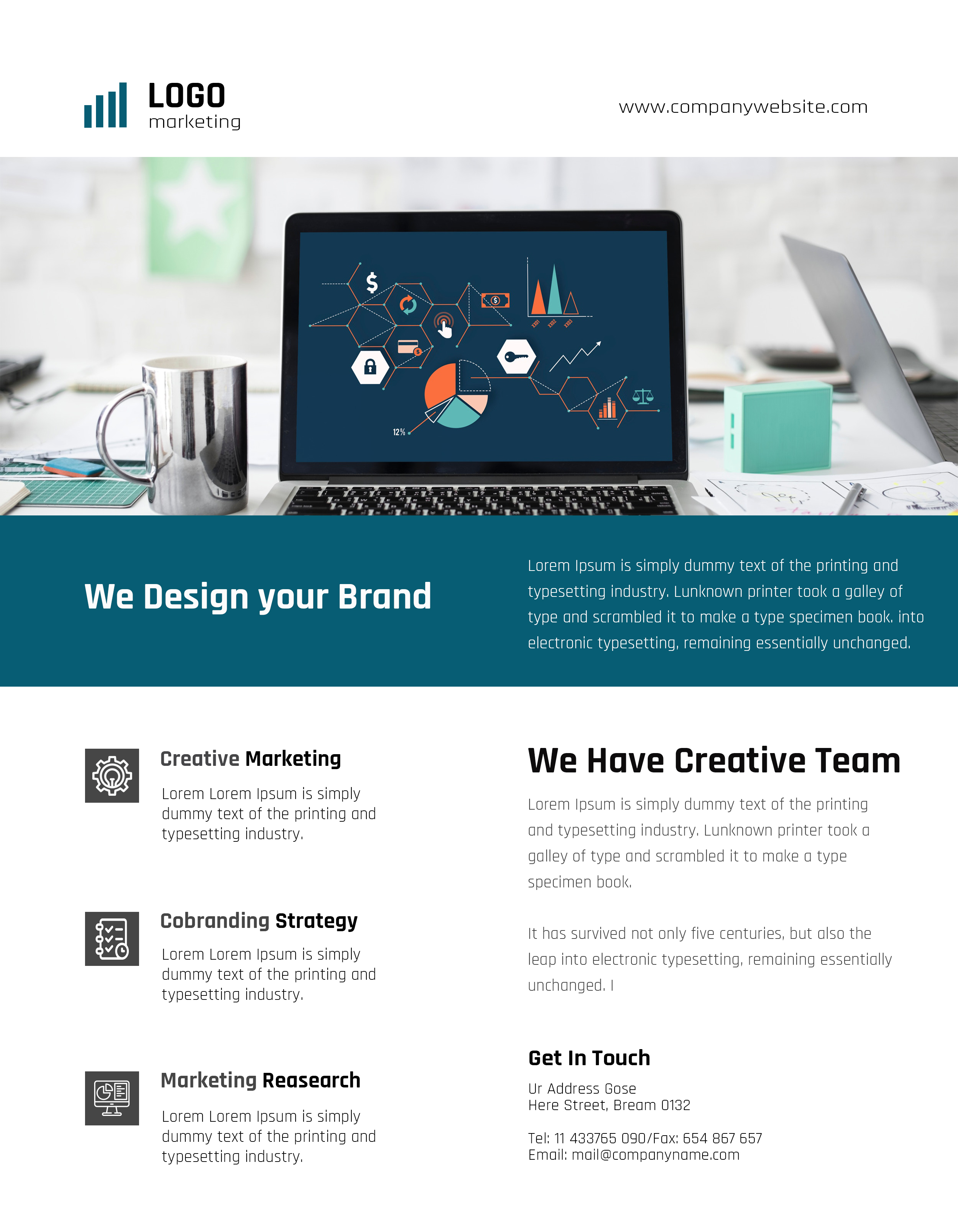
hi indeed your item is globally too flat in the first place, about a bit everything but in paerticular when it comes to lay out and typo. It looks like tons of items that were accepted before and tons that are rejected and sshowed here … the originality that u intriduced one of weakest points at teh samer time, too … this blue is unusual but this is also making u violate a major basic design principle, ie : contrast and this brings u to somehow some way violate a second one, hierarchy as the main title is almost not visible indeed. It looks like that u have a mistake on the left side too as the thing is neither pure white color nor colorful, in other words this is just not aethetic and irrelevant too
1 Like
Here is my another try for the category, I m not sure why i have been failing to submit a acceptable flyer.
hi buddy , have a look at your item and try to think about , how much time do u think anyone would save by buying your item? a little bit for non pros and very few for pros … so would they feel necessarily like they are saving time and that this is worth the drive buying your item? really nt sure, if u know what i mean … items like this one are countless and u can even see tons of them right here with people asking their item did not make it … in almost all cases, the problems are still the same … not original enough graphic part, too basic typo , used logo far from selling or improving the preview and a few mistakes as regard to the hierarchy of information …
1 Like
hello there!
thanks for your suggestion and help , is there any way that I could follow any design to make better.
hi this is preciselty what u shoudl not do … no need to copy anyone, just bring the thing of your own, some originality and freshness
1 Like
well , i m trying to do something.
cool, good luck
1 Like


another try not sure it will be rejected or approve.
the picture of burger are cool, the sahdow effectis not bad , but, apart from this , this is too empty to say teh least … u need more graphic work indeed. The title is misplaced and not aligned well , too, u should drop a smooth shadow behind it as welland maybe try to bring some effect to the table as well , not to mention that your footer needs to be reworked …
if u wish send me your design with layers and i will fix some thngs for u to see how to improve …
2 Likes
sure how can I send it too you ?
already I uploaded that if get rejected then I can upload again with changes? can you give me your email id that I can send you the design in psd layer ?