Hey,
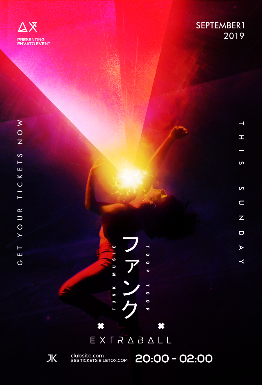
This flyer design is rejected, can you help me to understand what is wrong with it? 
Thank you.
hi for me this is a cool flyer though u really have to try to pay more attention for typo and hierarchy of information in particular … at this stage the typo is lacking a bit originality and font combinations and u fail to make some texts really pop out … especially for the most important ones, the time is , for instance bigger than the date … it should be the other way around …
It 's pretty cool but you have to increase the font size in certain places