why hard reject ?
Nothing original and take out the stock background and person which you cannot redistribute and all that is left is a few bits of text where the typography is not great and several elements feel forced
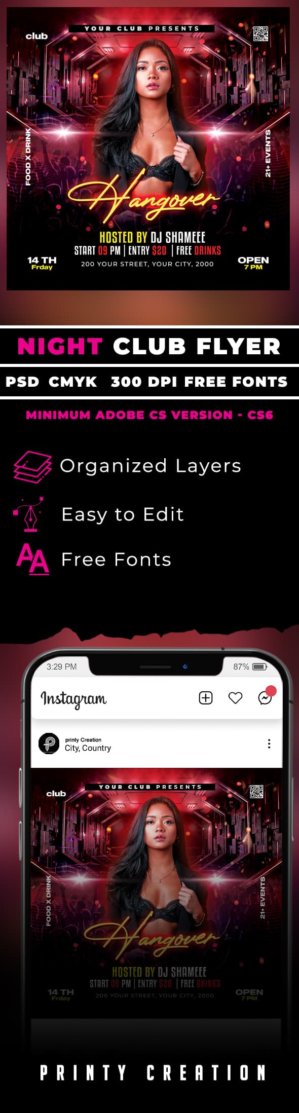
hi u have a lot of alignment issues in the first place and this is not a small deal as this is a basic graphic design principle indeed. You add one more these basic design principles with the preview file as spacing really not looking good. The global preview files by the way has nothing impressive to say the least. I assume that u did not really understand that this file is being used as sort of an interface between the designer and his / her work and the reviewer and potential buyer if the item gets accepted. In other words, this is an important element that must not be taken lightly. Contrast is not super impressive , too, I would not go as far as saying that u have been breaking this principle too but the bottom line is that there is improvement to bring to the table so that this is really satisfying about it … otherwise the combination of colors is not optimal ifs ask me and I would definitely withdraw the yellow color from the footer for instance , this is neither super readable, nor is this is looking good in my view … I am also wandering if u included the picture in the background, if not the download zip file may look disappointing