

hi I like the illustration part indeed, this is very tasteful, punchy and well executed but if u ask me there is something that is missing as regard to making the logo as a whole , as, right now, the logo lookslike making being made of two separated parts, the text and the illustration , for there is echo of the colors in the text part and the black color comes out of the blue, so to speak. The tagline could offer more relief with playing more with variations and so on and I guess that improving the spacing would help to make the logo look way better again …
1 Like
I tried symbol’s gredient color as text part but it didn’t work and that gredient and black color combination done by others. Ok, whick color do you want me to try for text part?
I like.
It is very clean, the color palette is well worked. As mentioned by n2n44, if you work a little on the tagline you could make it more interesting. Even the text you used for the name is very clean, clear, legible and context-appropriate. Also in terms of strongness it completes well with the icon part.
1 Like
Thanks, but which version is better? First or second.
yes because to apply a gradient, u need to rasterize the text
Im talking about the first version.
What I would do, maybe to space the tagline from the main text using the same space that exists between it and the icon.
Maybe try a version with lowercase tagline, by remove the gap between letters obviously.
In any case this is what I would do. I already like it, just working a bit on tagline, but the overall i think it’s pleasant.
1 Like
Hey ! Nice suggestions, i definitely try this.
1 Like

I find it much better with the tagline. The equal space between the parts makes it more detailed.
I also recommend you prepare some alternate versions, in addition to this one, before submitting it for review!
I wish you the best of luck with that, Akshayraj!
1 Like
Yeah ! sure , i will. Thanks for feedback.
Ps.
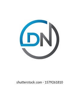
Can i give an advise? The space below in the V, so to speak the connection between the two lines in the V bottom. You could create a shadow on it.
In this style, for example, where the shadow is between the N and the circle. https://image.shutterstock.com/image-vector/initial-dn-letter-logo-creative-260nw-1579261810.jpg
or cuts in this style, in order to customize the font https://c8.alamy.com/comp/2AKJT80/initial-dn-letter-logo-with-creative-modern-business-typography-vector-template-creative -abstract-letter-dn-logo-vector-2AKJT80.jpg
However it is important that you remember to do this so that the text remains editable, so do not expand it.
Can you please give me your portfolio link to inspire !
PM sent 
1 Like