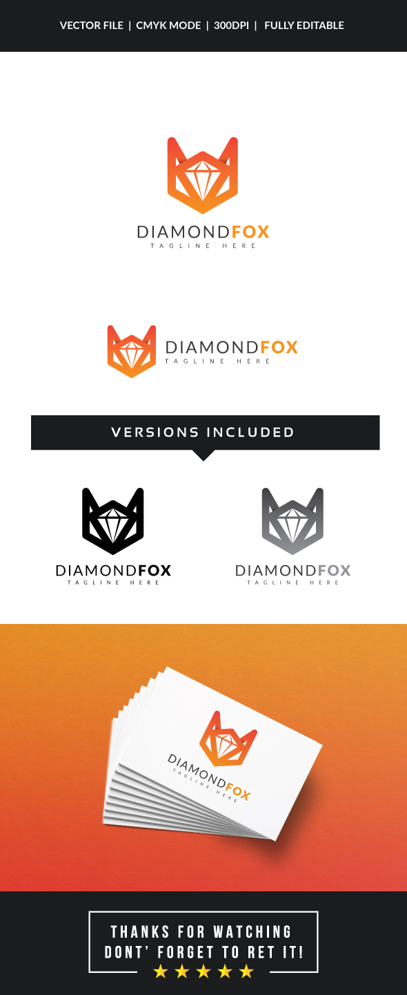
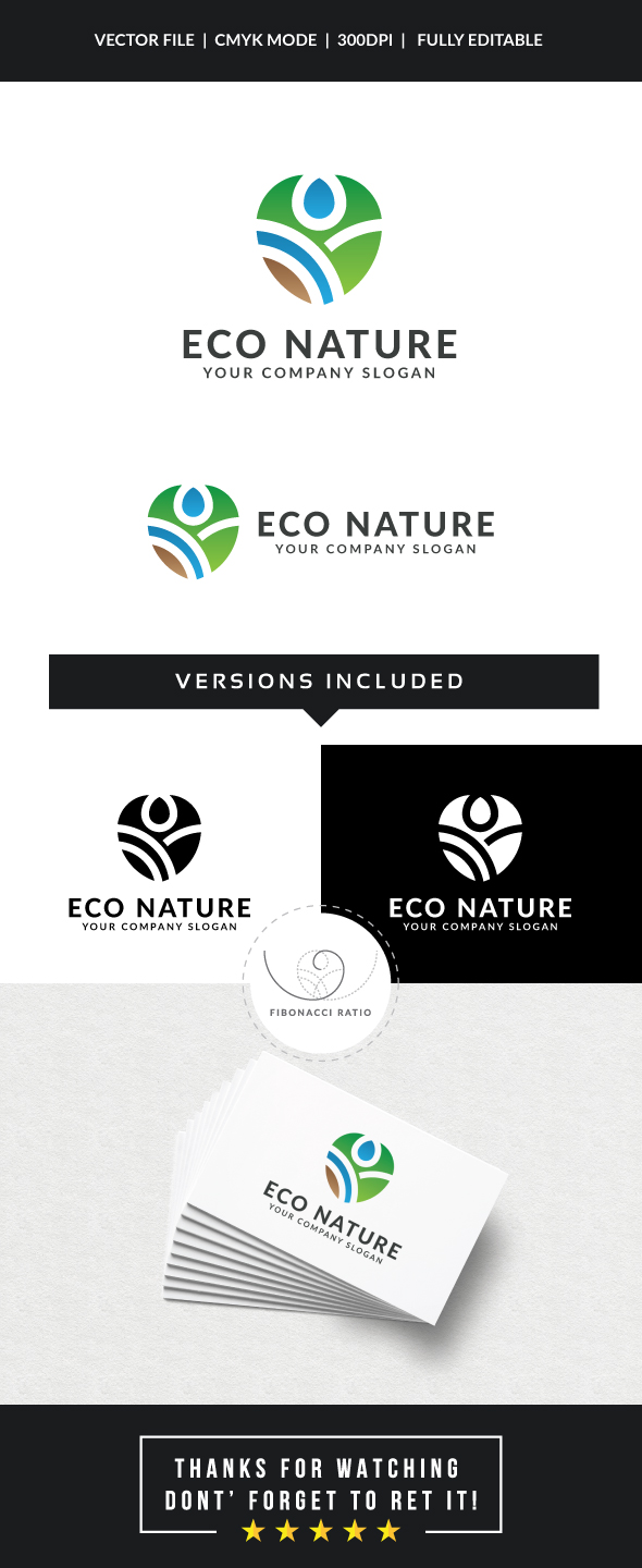
hi for me there is a cool idea with the first one, but some things to refine, for the other one, on the other hand, this is overdone … the diamond fox one, i believe that the main problem about it is that the edge are very thick and this is completely dissonant with the text part , not only is the graphic part taking over too much over the name but u also have a small issue of proportion between text and illustration, i think that u should choose a short name and increase the size of it (and the tagline too). I also tend to consider that u are not really well inspired to tried to put a orange color on a white background for the preview as your work is not contrasting well enough at this stage. As for the typo goes, this is harmonious, no doubt, but quite frankly this is rather dull and flat due to a combination of chosen typo and the colors u used. U would be very well inspired to bring more variations, more font combos and some touches of originality when it comes to the text part to gain impact and relief and for your work to look more outstanding. For the eco nature one, i have a real problem with the fact that this looks like having been done again and again beforehand. D not get me wrong this does not mean the design is really bad, but just lacking originality to say the least. Let’s also face it, your logo is way better in black and white version. I guess this is also partly due to the fact that the text color is killing the harmony of your whole design , with this color coming out of the blue, not being outstanding and definitely not matching the theme, too. For the typo part, the very same “criticism” applies, u can go to check what i wrote for the other one, all is fitting this logo too. I think that u have to keep in mind how much typo is an essential point here and that this is probably where are u are demanded the most effort in GR , no matter in which category u are posting. I would like also to add that for me the concept is way flatter here than for the other one, and that makes a difference in terms of originality too
Hi, Thank you so much for feedback, Appreciate
u are welcome , happy if i could help  if u have enough clues, pls check the “solution” box , good work and good luck