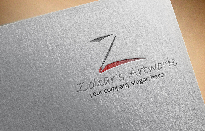
Dear Seniors, my two logo got hard rejection last week. Can anyone please advice me in details.
hi buddy no doubt that u did your best and invested some time in creating what u are showing us,though, honestly this is really not good enough this far to be approved in a very difficult category, in addition …
indeed, u need to put much more effort in the typo and fonts combination indeed, this is either too common for teh second logo or clearly not matching for the first one …
your tagline is too thin and almost invisible in the second logo
if ideas maybe interesting, you have to them a better graphic look so that there is a chance for your logos to be accepted here …
keep doing your best and try to push the graphic envelope a bit farther again 
Thanks for your feedback, i’ll try better in my next work.
u most importantly have to learn some mechanism indeed, as u have to get to identify what is expected here, examining a lot of things that can go through should help, this way u will probably realize that typo matters much here , sometimes a bit too much in my view by the way, but this is the way it is …
Thanks

