It is my first submission for Logo template and I received a hard rejection from evanto team as "it isn’t at the quality standard required ". Can you please give me your feedback is it more a problem of visual or a technical issue?
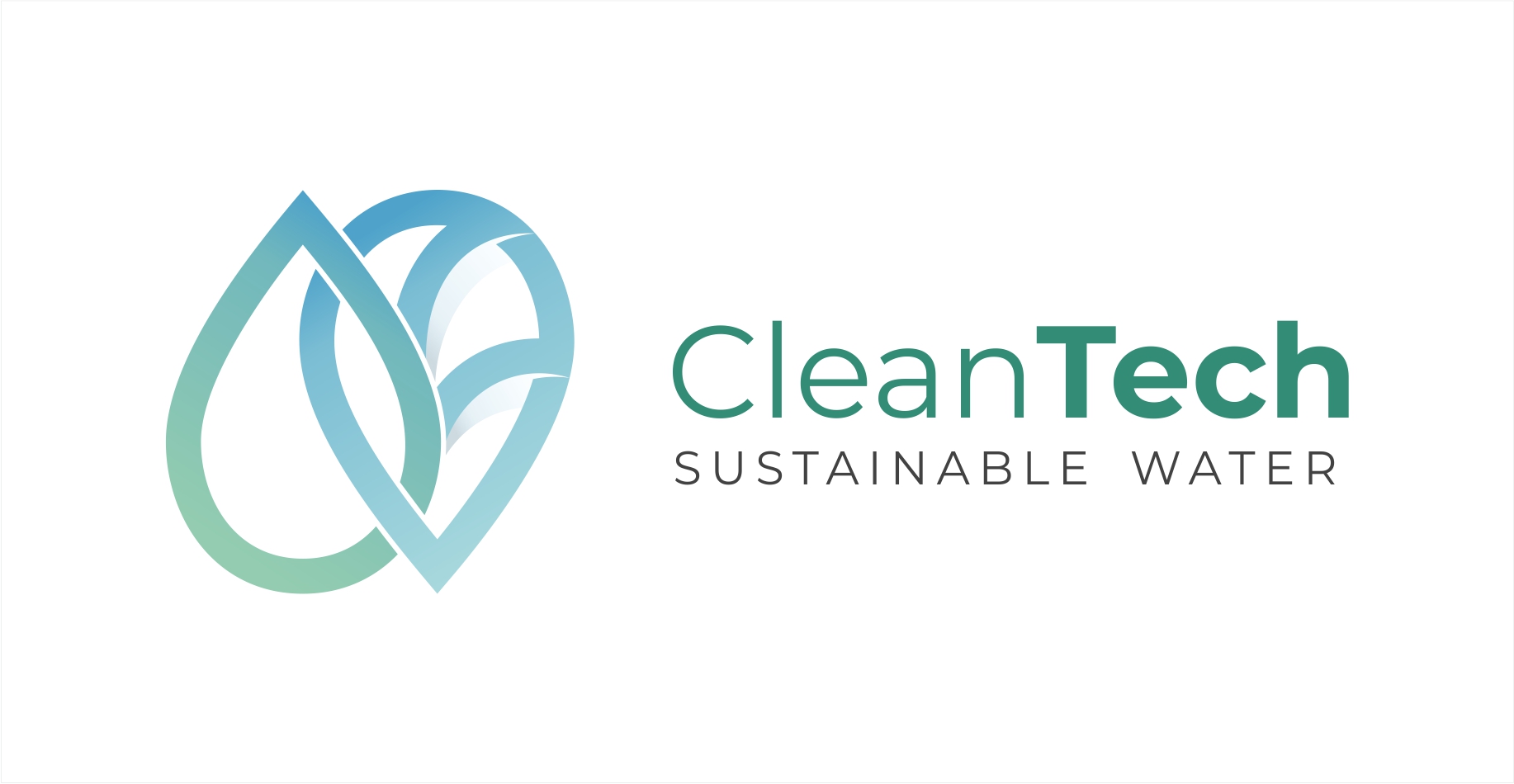


Your logo look nice and clean but in my opinion the idea/concept is not clear enough. The sign it’s a mix between a water drop and a leaf? or it is something else? Try to play more with the negative space and proportions because now the sign it is a little bit too large. Also you need to create a version with the sign on top of the text.
2 Likes
Thank you for reply and comments.
Yep, it is leaf + drop combination. I have a vertical version on submission, but forgot to add it here.
As for the negative space and proportion - great idea!
@DesignSomething u maybe a bit right for teh concept thing a bit but the work as far as the illutrastion goes i a quality one and after all they may ket potential customer to decide what this is for them and if this is appropriate or not
@Katzcantread
for me the thing is rather the typo one , i mean this is clean but honestly this is also not super original typo wise and combination wise , when, maybe , they are expecting more this side
Thanks, I was thinking that type part is not that crucial, try to rethink that and use it.
we may agree or not - as for me i think that this is not this legitimate - but here typo is probably the most important issues of all …
Strong concepts and unique ideas attract more customers then common designs. Usually customers search is based on specific terms. When I start creating a new item first of all I search the marketplace based on my concept and analyze the results in order to identify the best products with similar idea. The best scenario is when the search result return with few similar items. That means you have less competition and more chances to sell.
In this case searching for “water drop leafs” it returns with 159 logos with similar concept. That means it is very hard to bring something new and for me does’t worth to play with this concept.
i identify what are trying to explain and agree indeed, though, in my view, even this is more difficult, for sure, this is because u have a lot of items already that the one u will create will not bring something a bit new to the table and here the focus is supposed to be on quality even more than on uniqueness. In addition, this is not because there is almost nothing in a category that u necessarily get approved all teh same … i experienced this in the logo category
And another thing that I understand during the past years is that the customers are attracted more on design kits rather then single templates. They love to have many options to customize and play with.
u maybe right but honestly some guys buy our stuffs to modify them gamely anyway … and what u mentioned is not easy to do for all categories to say the least
i have just seen buddy, your tagline and title are not well aligned lol sorry
Thank you for comments, I rely don’t take much investigation before submitting, that is a good point to understand what people need.
Yep the Type part is just a mess, I see it clear now.
Good luck you are the first that I can said YOU CAN
1 Like
no this is not true , this is not perfect, this is another story … quite frankly i think there are some that are not better to say the least which made it all the same … in this case typo can probably be imporoved a bit, this may help to take your item to the next level and potentially have it accepted, this is all what i wanted to say