Hi everyone,
I need your support tohelp me either fix the issues with these logos or give me directions to improve my future logo.


@DesignSomething @n2n44 @charlie4282
Thanks in advance.
Regards,
MJ
Hi everyone,
I need your support tohelp me either fix the issues with these logos or give me directions to improve my future logo.
@DesignSomething @n2n44 @charlie4282
Thanks in advance.
Regards,
MJ
Hey guys @charlie4282 @DesignSomething any comments from you?
I need to understand why my logos are always rejected?
Regards,
MJ
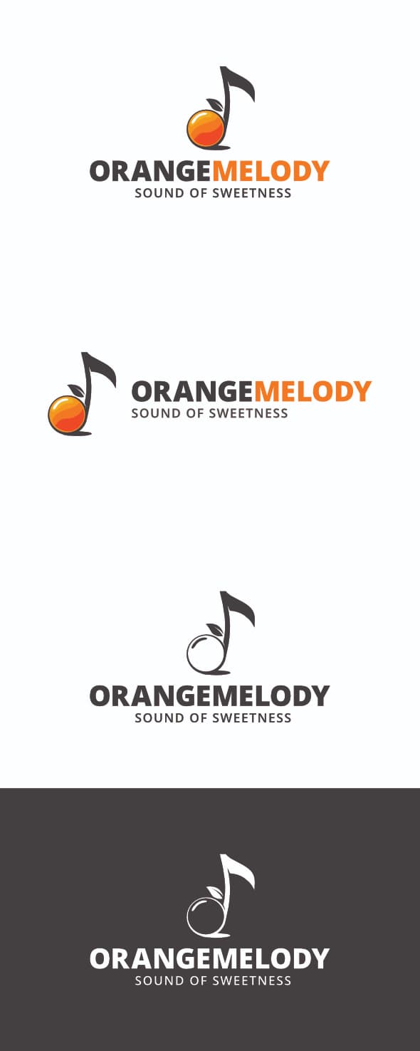
hi there. Well, I will go straight to the point , for me the juice one is good , attractive looking , rather original and so on, but for me the real deal is that even if u aligned properly the alignment looks wrong this way , as the center of the note should be centered with the text and not the full illustration , otherwise , visually speaking the alignment looks badly executed for the eyes even if this is technically done properly indeed. I also assume that there is something to do either about the global proportion of text and illustration and as
For as the positioning of the text towards the illustration goes. Imbricating both parts more accurately would not hurt, if u ask me , in particularly as far as the horizontal version goes by the way.
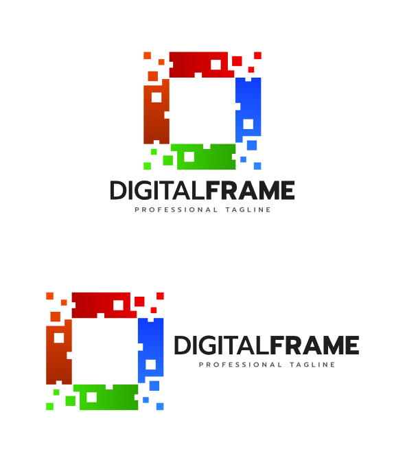
For the digital frame one, honestly , I think that this is neither original and aesthetic enough at this stage and that the global concept is quite flat and not really that interesting , when this is more likely to be the other way around that is expected from u. In terms of style , this logo looks also quite outdated in my view. I do not think that color combinations work well. I assume that choosing complementary colors or shades of the same color would be a much better and safe idea in order to make sure that colors are matching really well and that the logo gets more aesthetic in the process. One more thing also is about both the positioning of the text and that proportion between text and illustration. At this stage , according to me the illustration is very much prevailing on the text part , too much in my opinion.
When it comes to the “digitalized” logo , well the concept is more than deja vu and the thing looks even more “common” when colors , styles and typo are likely to inspire the same kind of feeling , to say the least. There is a real effort to do to bring something that looks fresh or new. Do not get me wrong the thing looks clean but this may not be sufficient to make it for sale all the same , in a context where so many logos are already on sale and that a lot has already be done in diverse styles. Also beware of not using some previews that rather make u tend to violate some basic design principles… if u have the black version of this logo with such a thin font for the tag line, the immediate result is that the contrast is lacking and that the text is very little readable indeed
Hi @n2n44
Thanks for the valuable feedback and critiquing my logo designs. Highlyappreciated.
I have made some changes to the first logo as I understood from your comments. I hope it can get through this time.
@charlie4282 @DesignSomething what do you think?
Thanks again.
Mahfoodh
for me this looks globally better but I fail to understand why u have changed the typo for a less original one indeed. U still have some improvement to bring as fas as imbrication between text and illustration goes