With respect, I do not think this has any chance of being approved -
-
font choices are not good
-
no hierarchy
-
very basic design without much to it
-
typos
-
the background does not feel like it fits with the rest of the design - the whole thing just feels like many different elements put together without any design configuration or logic
-
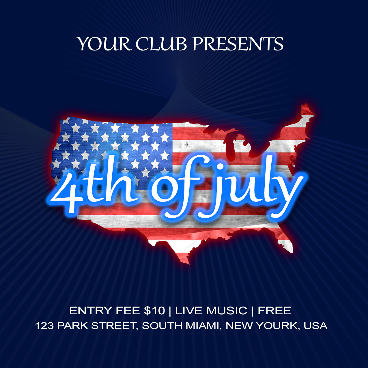
you need to be certain that you have the right permissions/licenses to use that map/country outline if it is not an original asset
hi sorry to tell u just this but this is miles away from standards for a variety of reasons that I am going to enumerate
1- global style
quite frankly, sorry I will tell u the ugly truth, there is close to no graphic design here …and people may legitimate wander what they are going to buy here … pls see next point
2- very low commercial potential
indeed, for a buyer to feel like purchasing an item, u have to either offer something making them have the feeling that they will save significant time or offer something beyond their own capacities graphic design wise and , to tell u how I feel , there is none of these two ingredients here … any person with basic design knowledge can redo this type of item in a few minutes , so why buying? (in particular as what u have in hand right now is nit even perfect otherwise) and most importantly why would a reviewer accept such an item? u have to think about additional value and push the envelope graphic design wise in my opinion …
3- global lack of concept and style
indeed, there is not real concept or initial idea here , a flag on a shape and a typo on top of it … I assume that most of the people would expect something much more elaborated from a creative person, if u know what I mean
4- spacing
it needs to be improved , pls keep in mind that this is a template and for this very reason u are expected to create something perfect about it as u can even choose to adapt the content to make sure that u do
5- mistyping
as there is no possible copyright issues or whatever about the name of a city , the only conclusion that people will make when they read the info is that “new Yourk” is a mistyping and the - I guess u will identify this - looks not professional …
6- coherence and cohesion
why choosing a combination of serif and non serif fonts looking randomly determined in addition? for me not only this makes no sense but this looks not good visually speaking, too
7- background
I am sorry to say just this but at the moment u have very little work out there and, as a result, this looks empty and flat indeed, especially once combined with the spacing issues that I refered to and the very varying aspect of the global repartition of used space and empty spaces …
8- like of balance
this is what I evoked just above , some parts of the flyer looks completely empty whereas some others have rather bulky stuffs, like in the center of the canvas and having so much difference from one thing to the other breaks harmony
9- what, who, when , where
I guess u do not answer all the necessary questions here and thus there is a problem … u have to make sure that a templates offers all that people may be asking for so that if they ever buy they can arrange things easily without having to modify a lot of things
thank you very much  i will consider all the points and try my best
thank you very much followed those rules and do my best
u mean “will follow” right? because u had done I guess the item would not have been rejected lol anyway good work and good luck buddy and if u have enough clues about what to do with your item pls check the solution box 
ohh ya ya “will follow”  thank you n2n44
u are welcome
 ?
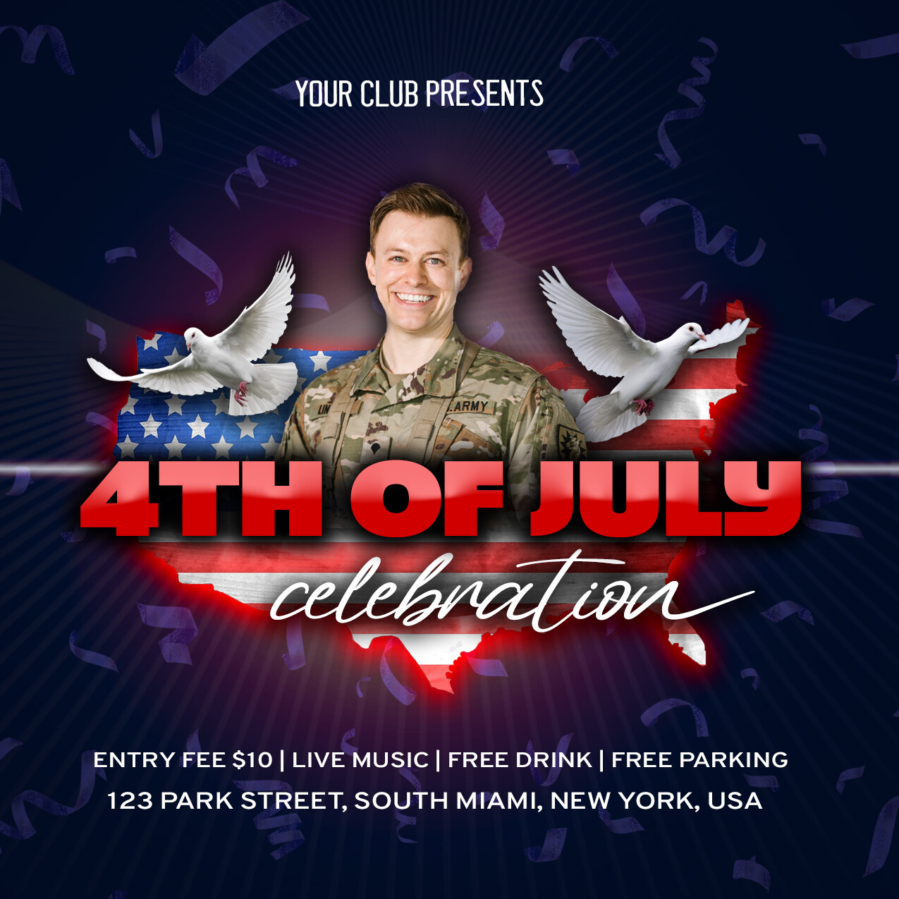
?hi there is more work and the global organization is slightly better, though there is much to improve, change and take to the next level so that the item has a chance to make it for sale … header and footer still look disconnected from the rest position wise, the typo is still not matching well as the header and footer are disconnected from the rest and not even connected with each other. The main title in red color like this is simply not popping out while this is the main title and central information, this the one that should pop out the most , too. Doves looks like coming out of nowhere and do not look really relevant in this context if u ask me … the lighting of both the soldier and the dove looks not properly done as regard to the rest , u have to identify where the light is coming from and dodge and burn the elements accordingly (if u do not know about this, I recommend the channel of Nemanja Sekulic, who is a great artist and teacher who details just this superbly in some of his videos). The name of the club in the header for me as never made sense and in particular in such a context where this prevents u form giving it the proper attention, impact and exposure (for branding matters , this is not fitting the needs of a potential customer , even if I am conscious that a lot of guy here do this, this makes very little sense all the same … ). there is also a problem as the date is not properly written and same goes with the time , too. The global occupation of the canvas is not done well enough , too , as there are some parts which turn out to be much more busy while some others are pretty empty , which breaks the global harmony indeed. I would also recommend that u put more lights in the background to generate some depth, the overall composition looks a bit flat and “one-level- restricted” right now