Hi Please Give Ideas Why Reject my Design I am Designed Properly. “Layers” every layered Named and Photos are “smart Object” Easy to edit and Guide Help “PDF” Attached main file but “Hard reject my Design” why ?

Nice design, but are you sure 3000 dpi? 
sorry you meen 300 dpi
i am sure 300 dpi. can i checked …100% Sure
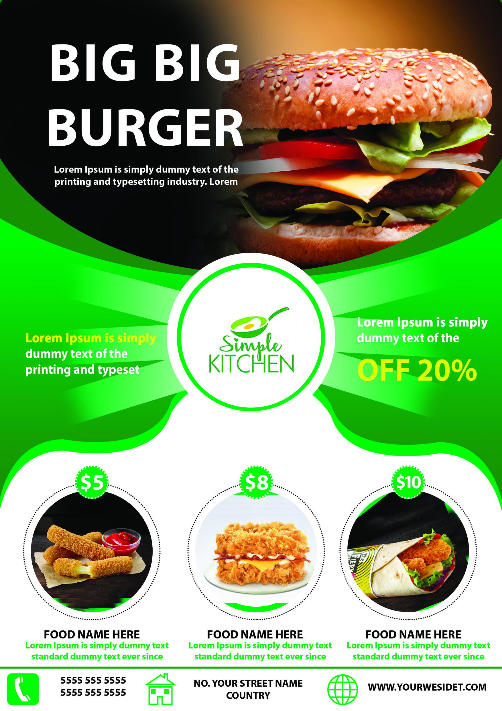
I am not an expert in design flyers, but I just want to give an opinion about your design. the most I think needs to be fixed is the choice of bright green. as far as I know the delicious impression of food fits perfectly with warm colors. the second may be that your layout can be more attractive to attract more buyers.
this is only my input, hopefully it can help you to be approved.
i am try to change images and resubmit this design again.
ok do your best and i hope your design get approved, Good Luck !
The main problem in this design is the typography and the layout. Maybe the color choice is not fitting as @Logokamu stated, but if you want this design to get approved you need to totally rework it under every aspect.
2 Likes
It is the typography that needs correction.
Use visual heirarchy concepts for font size. Try to use grid for proper spacing and alignments.
Make sure your text is readable properly. Maintain contrast. Eg: white text on green is not clear. Also white text on black is also not clear. Heading font size needs correction as well. Yellow text is also not readable.
Color green is too bright in this case as mentioned by others already.
Whole design will take refinement and inspection actually. But i think you should get the design concepts clear here.
Try to work on these concepts one by one: Visual heirarchy, typography (font size and line height ratios), contrast, grid and spacing, negative or white spacing, alignment.
thanking you brother, for the idea
1st image is not original 2nd image is original design. but i am try to reedit this work.
thanking you brother your ides ok, i am worked redesign.
hi i personally believe that the typo is the main issue and the second major problem turns out to the hierarchy of information … the fact of the matter is that some of your texts are unfortunately difficult to read , those in green color and that the typos u used are basic and necessarily matching so ell with each other, u should try to make an extra effort about typo on titles so that u can make sure that they look more outstanding and pop out much more than here , if possible. Please consider also the spacing between texts and tryt o make them both harmonious and logical if possible
too bad that u did not try to inspire from what u did for the logo and try to apply this to the whole flyer so taht u would have had harmony and more elaborated font combinations 