
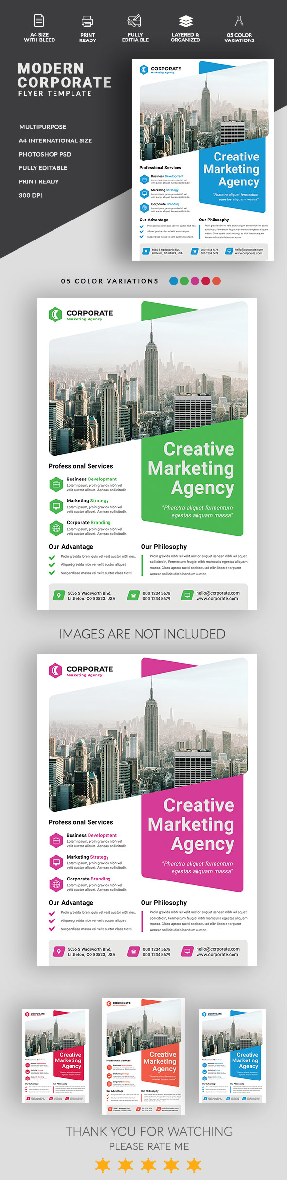
hi apart from not being original and looking like already existing items , there are a few things that u have to work with …
1- contrast
some color combinations are not the best when it comes to readability and making texts look outstanding so that u also have a good hierarchy of information too …
2- text positioning and spacing
texts and elements are too close from edges and this is making the content “choke”. It looks “crammed”. Free / white spaces are important
3- fake logo
the logo does not look outstanding and does make your item look better , this is the other way around, not to mention that this is hard to understand what is the link between the illustration part with the supposed activity …
4- variations
there was a good idea in the first place the problem is that the way u play with fonts in “business development” and all other professional services is simply not working as the bue part is not readable, not outstanding either and even hard to read … and the problem is that this part is not less important than the very valued one right next to the blue parts …
5- global style
style not original enough and too minimalistic . Basically u have not much graphic design here and this is reducing the marketability and commercial potential of this item … why would people buy such an item that they could redo in 15-20 minutes? if u wanna how i feel people are not saving time to buy this so they would not buy , this is this simple …
1 Like
I agree with 80% of what you write here 
Thank you bro
what is differing, i am interested in knowing … many things can be discussed indeed
oh… little things, I don’t want to start discussion with you because this will be long looooong “word ping pong” hehehe
I agree with 80% and this should be enough hehe
yes i do