With respect there is all sorts of wrong here and the best advice would be to step back, familiarise yourself with the standards of successful items already for sale, and spend some time refining your own skills and grasp of the basics
-
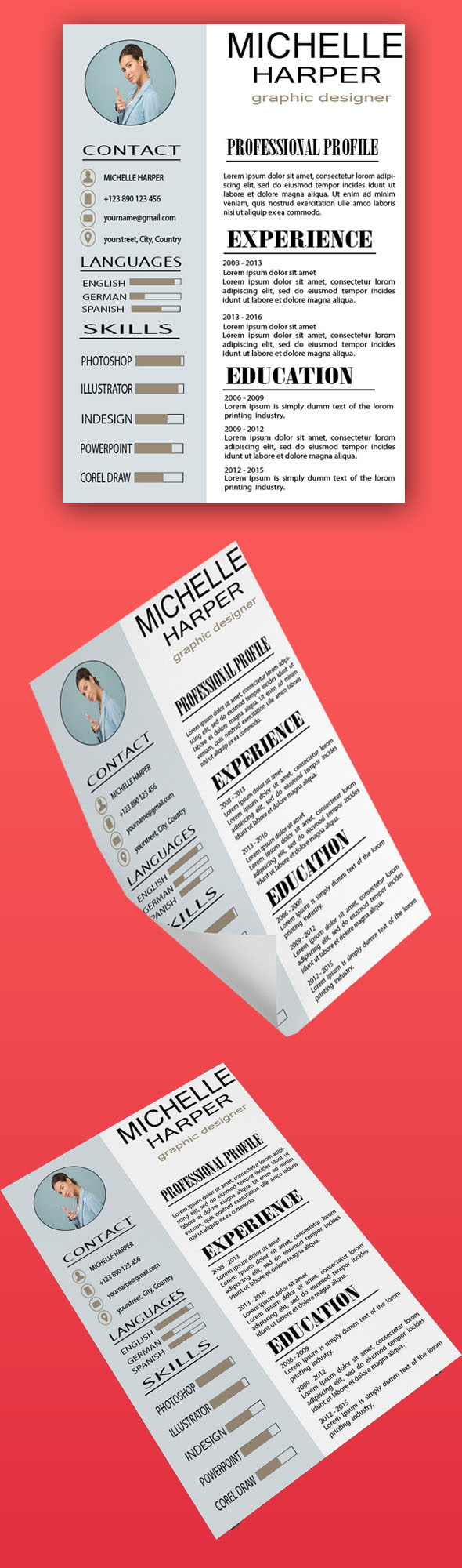
The preview looks stretched and out of perspective
-
There is no control of basic design fundamentals like spacing, padding or margins (look at icons top left, how close to the right edge ‘Michelle’ is, the spacing between everything in the left sidebar, ‘name and job title’ is not even centrally aligned!)
-
Zero hierarchy id experience/education etc. content
-
Typography is all over the place with multiple fonts, styling, font-styles
wow! sorry, i am sure that u did your best and thus do not take this personally but quite frankly this is really one of a kind when it comes to typo and this is really far from standards if u ask me …
look, the fonts are definitely too big to say the least …
i can identify that playing with sizes of texts is a good way to build an interesting hierarchy but all the same, the texts are really humongous lol needless to say that even people with a slight viewing problem would be able to read a part of the texts lol
more seriously, what i tried to explain to u is that u have other ways to build a strong hierarchy rather than just trying to bring very big texts to the table, especially as u ended it up having much trouble to deal with what u had started to set up … choose a reasonable font size according to the supposed target … (lettered adult do not need big characters, old people and children slightly require bigger ones …) makes sure that all the texts from the same category, titles in the case are all being included in the canvas at the concerned style without u do very non-aesthetic things out of compressing texts … makes sure that u have harmony it terms of font combinations, too. Serif fons usually look older or more outdated rather easily so use them appropriately …
the name and function re way too close from the upper edge , as such, not sure that they will not be cut as inside the trimline of in the safety zone for sure , which means that aesthetics will be impacted and the text will look like chocking …
global style. this is quite flat and definitely generating a deja vu feeling. u need to push the envelope graphic design wise, loo, at this stage, well your “graphic part” is only made of lines rectangles and flat icons …
commercial potential
what is resulting from what i mentioned just above is that your item has a very limited potential commercially speaking … who would buy a thing that they would be redoing easily (they would not feel like saving some time out of buying, ifs know what i mean) and will do the other way around , ie: save money out of redoing the item, especially since , as such , the item is far form perfect …
color combinations
this is globally dull, the sort of ocre or hazelnut color is neither matching well , creating harmony or bringing any real contrast to the tables which ens up flattening either your hierarchy of information and the whole item in the process
alignment
there are many things improve about this
spacing
there is much to do , make sure that all items from the same category are having the same spacing and same goes from one category to the other …