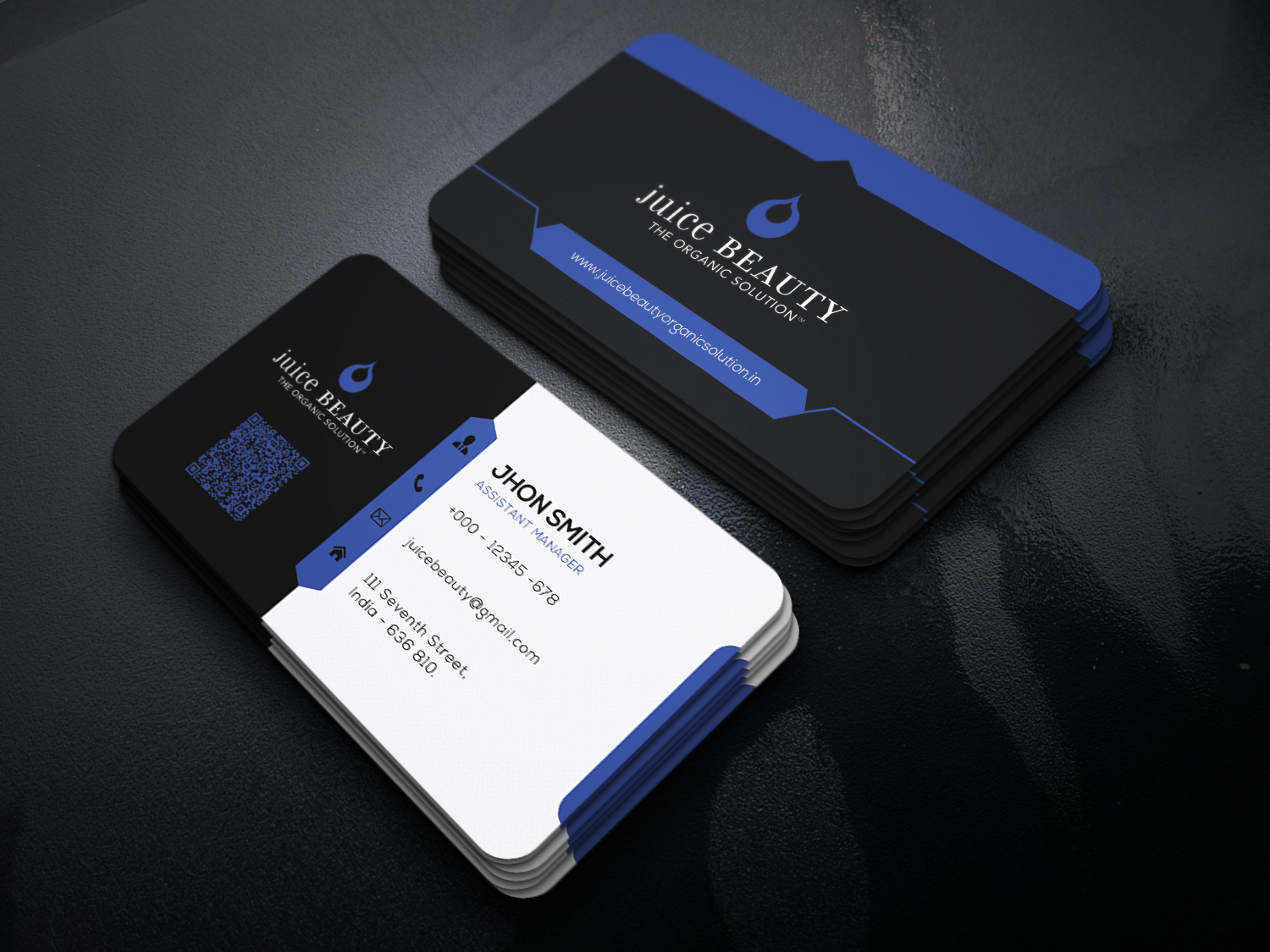
Hi, This is my design. Please suggest to improve my design and get approved.


1 Like
hi this is globally wort of clean as harmonious, though there are a collection of things that u have to deal with … globally the style is not super creative or original to say the least and we can say the same as regard to the color combinations indeed. the font combinations are not necessarily working well as u have serif older style fonts mixed with more modern ones and there is not real harmony , not to mention that combinations are not super creative indeed. The logo side is sort of still flat and too simple and there is globally not that very much graphic design in what u have at this stage , thus decreasing the commercial potential of your item, as it could rather be a easily and quickly remade so people may not feel like buying as not saving real time…
icons are not popping out much and a bit simple to bring so more interest to the global design
this is just a detail but as all details matter, the fake logo is not necessarily “selling” u should invest some time to create a real decent professional looking logo that will take your preview to the next level indeed
1 Like
Thanks for the valuable feedback…
2 Likes
you are welcome, happy if i could help  and if u feel like u have enough clues about what to do , u can check the "solution " box
1 Like