I got tired to post my design and every time was rejected i improvement my design but again reject…
WHY…?
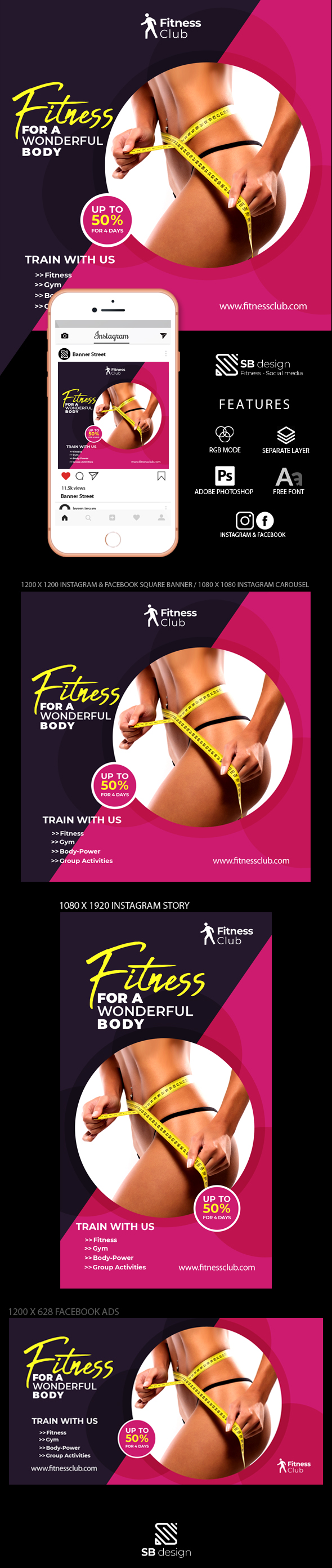
hmmm thats strange… i would download the design, nice and clean. Maybe it’s the stock photo since its a little, and I stress A LITTTTTLE revealing. Good luck, hope to see this template available!
thank you but how can i uploaded this template again…
you think i change the picture…?
hi this is clean in my opinion , harmonious also , bu u have some issues to potential fix in order to take your item to the next level. First of all have u ever heard about z-shape reading process? the eye sweeps away through documents, from top left to top right, then slanted way to bottom left and to hand up in bottom right section … here the disposition looks a bit random-like … for some formats , even though i also identify that u tried to follow shapes … but in the end u end up with rather misplaced elements like the logo for instance. Som texts are also a bit too close from edges and this is bringing a “choking effect” to the table indeed. I also recommend not to have texts being crossed by shapes, since these texts are becoming really hard to read in the process … hard to understand, finally why all the things are not properly aligne don the left , the “train with us” , the activities and the website this making the lay out look more uneven in the end …
2 Likes