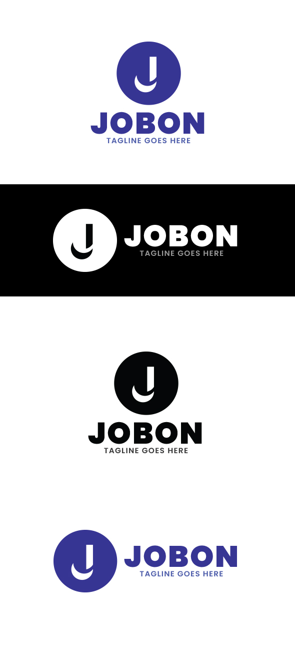
I created this J letter logo with a crescent moon. But I don’t understand why it was hard rejected. Please explain the reasons of this hard rejection.
And the concept is … ? For what type of business can be used?
1 Like
Crescent moon was known to symbolize womanhood, fertility. So this logo can be used for any product or brand that is made for female.
Crescent moon can also be symbolic of growth & creativity. So any brand who want to show any kind of growth & creativity through their logo, can easily use this logo design.
For example, 1) any Financial Company whose name starts with letter “J” can use
this logo.
2) any Graphic Designing Company whose name starts with letter “J” can use this logo.
The shape you created and font that you use has nothing feminine. The shape looks like a hatchet and the font is perfect for heavy tools.
1 Like
Thank you so much for letting me know your valuable opinion. 
hi indeed, what u have to keep in mind is that a concept must not be explained lol people should get it on their own and if u do not feel that this is going to be what’s going to happen, then then concept is very unlikely to be exploitable, according to me. Besides, let’s also face it, even regardless of the concept not being understandable directly, nothing feminine transpires from what u have at this stage … and no one would buy such a super simple thing, for people to have interest into buying an item, it takes that u either make them identify that they are going to save time out of buying or that they are going to be able to offer going far beyond their personal graphic design skills. In both cases, this is not what happens, in other words, the logo has a low commercial potential and why would the reviewer accept it in the first place , if so? moreover, the illustration and text and not matching terms of style and there is disharmony between both parts consequently … does it also make sense to flag the text in the middle for the horizontal version? in my view this is not and this is ruining the imbrication of both parts, too. I would advice that u try to push the envelope graphic design wise, since as such this is far too simple and putting some gradient, effect of whatever would help to generate relief and bring some extra value to the table …
1 Like
@n2n44 Thanks a lot for explaining the reasons of hard rejection so well.

@n2n44 but I saw this simple S letter logo on Graphicriver yesterday. It looks very simple & I think it has no meaning. Why did this logo get approved by the reviewer team of Graphicriver ? Please explain the reasons.
sorry buddy but if u ask me, this logo that u are showing a very very very much better than the one that u had created … I do not mena that it could not be better with more continuity in terms of colors or such things but the abstract and modern S is quite selling though in plain colors and the harmony offered is way higher than the one that u brought to the table at this stage. I guess that this is a bit wrong for u to compare to others that are better and for u to feel that this is not right for your logo to be rejected. I mean of course u have to try to keep some confidence, but u also have to get a clear mind as regard to what u have been creating, what maybe the weaknesses and the good things and most importantly listen to other people’s point of view explaining how could do a better job. Then u will be freer to follow what u are told or not , but opening mind is important indeed for u to take your game to the next level on the longer run
1 Like
@n2n44 Thank you very very much for this detailed explanation. I will try to improve my skill before my next submission.
just try to find a cool concept and take your time to make sure that the way u materialize it looks cool and work enough, this is the best advice that I can give u I guess  now if u have enough clues as regard to what to do pls check the solution box, then good work and good luck
1 Like
I am extremely sorry. As English is not my native language, I can’t understand properly what did you want to say with these above words. It will be very very helpful to me if you please explain it again with simple sentenses ![]()
flagging is determining the way the text is aligned - if u flag on the left this means that the lines of the paragraph are aligned on the left , in other words … - and what I tried to explain is that for me this makes way more sense to flag the text on the left with the horizontal version …
1 Like
@n2n44 Ok. Now I have understood it. Thanks a lot for explaining it again.
I have two questions:
- What should I do to match the text with this illustration ?
- What do you mean by disharmony ? How can I achieve harmony ?
I request you to please explain it so that I can improve my work.
work ! lol I mean just test all the font that may look suitable for u and choose the best one, the one matching the most with the type of illustration that u have ,… choose preferably a font which is not too common and used by absolutely everyone …
this means that the combinations do not always work and that the style of the diverse parts do not necessarily match , hence a negative impact visually in the end …
1 Like
@n2n44
Now I have understood it. Thanks a lot for explaining it again It means a lot to me.
If I make an abstract letter logo without any concept / meaning, then will that logo be accepted by the Graphicriver ?
well there maybe more chance , it also depends on how u execute it … but in any event, having a real concept is better …
1 Like
@n2n44 thank you so much for this suggestion Now I’m making an abstract letter logo. Let’s see what will happen.
1 Like