Hi all.
The attachments I’ve submitted are some of the graphics that were rejected hard. Can you please share your suggestions and opinions ? 
Thanks.
PS:
Designs are full editable.
Downloads are set according to ENVATO recommendations.


Hi all.
The attachments I’ve submitted are some of the graphics that were rejected hard. Can you please share your suggestions and opinions ?
Thanks.
PS:
Designs are full editable.
Downloads are set according to ENVATO recommendations.
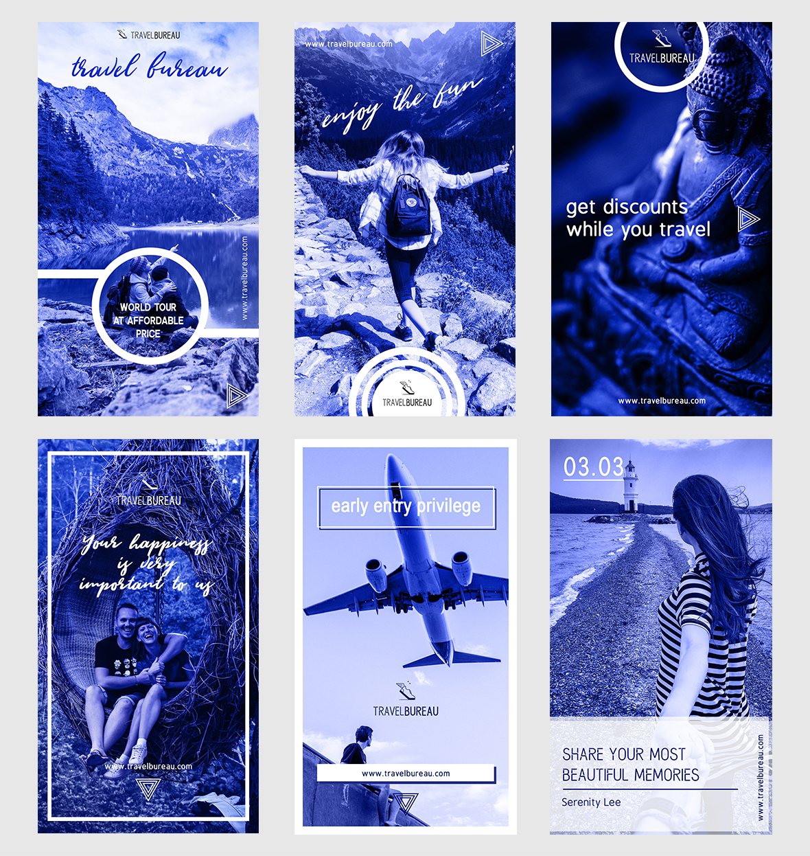
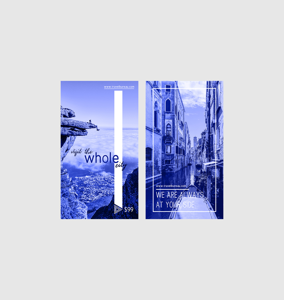
hi globally for most of the ads that u created, the typo part is hard to read and thus the message is not conveyed in the best way … there is something to do about alignment, disposition and so on according to me … in the blue set, u clearly are violating a major basic desgn principle too as there is very little contrast between the text and the background and once again this is hard to read , so what is the purpose to advertise if people cannot read your information …
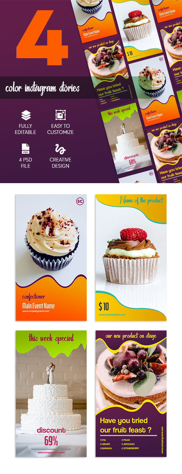
for the first set of instagram stories indeed, the typo has to be redone competely in my view as this is neither harmonious, nor is it aesthetic too
the thrid one is way too flat , there is an issue of contrast and managing once again to read the content
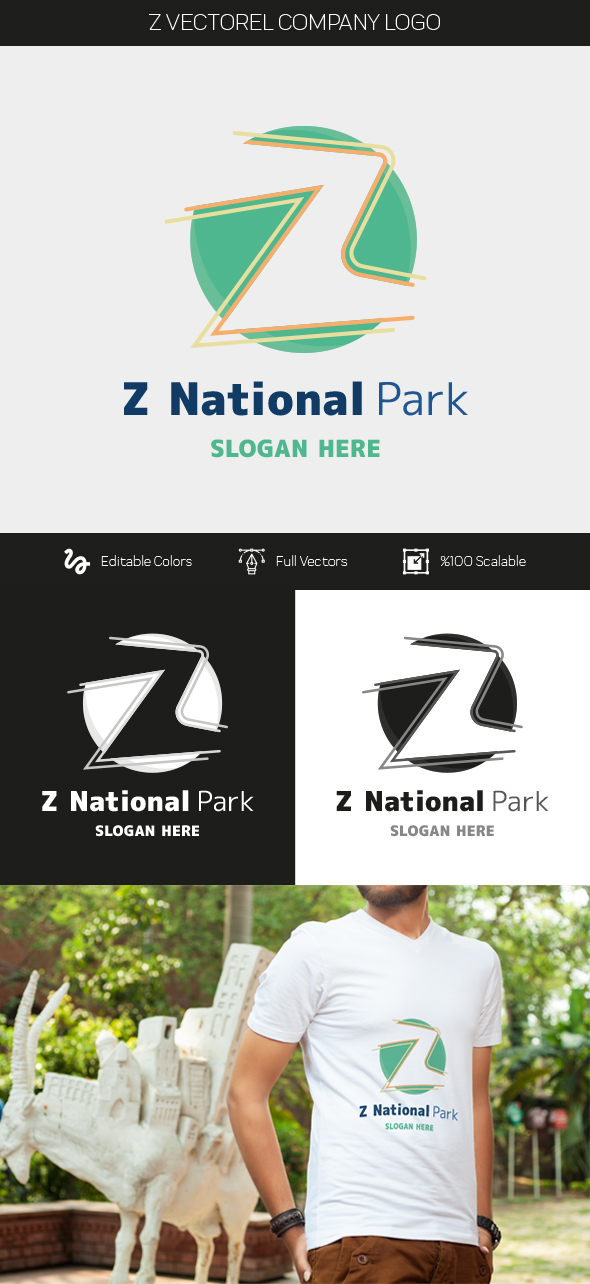
the mouse logo is original i rather like but teh typo part is not convincing and not sure that they will not consider the shape as “too thin”
for teh sea travel one, as for me i tend to believe that typo and illustration are not matching well and u should combine fonts more between tag and name … wiht a decent typo part this will be rather nice
the last one is rather nice like this but once again u have to pay more attention about the typo and make sure there is sort of an harmony between the z illustration and the name and tag …