Hello,
first of all, sorry for my english, i’m french 
So, I just registered as the author of the site, it turns out that my articles was rejected, yet I followed the tutorials but nothing to do after several attempts. Thank you for your help.
Hello,
first of all, sorry for my english, i’m french
So, I just registered as the author of the site, it turns out that my articles was rejected, yet I followed the tutorials but nothing to do after several attempts. Thank you for your help.
bonjour, il me semble que le problème que tu rencontres ici est un problème de typo avant tout … la typo est un paramètre très important ici, même clairement surévalué car trop prédominant , cela peut être source de reject complet d’un produit alors que changer la typo n’est pas vraiment toute une affaire dans la majorité des cas …
ici, il me semble que la combinaison n’est pas optimale et que le mariage des styles peut clairement être amélioré, d’ailleurs , le plus gros problème sans doute sur ce que tu as fait , c’est que les paragraphes sont ds une typo qui est difficile à lire …
je pense aussi qu il serait bien qu’il y ait plus de liant entre les volets … ici , chaque page semble un peu détachée du reste et l’espace (ou le manque d’espace) entre le titre est le soustitre rend la lecture une fois encore plutôt difficile. Perso, j’opterais de préférence pour une fonte plus bâton pour les paragraphes et changerais les espaces entre titres et sous tites en mettant un espace plus conséquent entre les 2
tu as un peu trop un système de blocs pour l’heure et photos et textes sont un peu “déconnectés”
sinon l’ami tu es au Senegal ou sénégalais d’origine?
who is thething that u wrote, me? watch your language pls!
the guy is not feeling comfortable with english so i answered in french … if u have a problem with that u can also use a translator if u wish or politely ask people to tell u what the message was all about!
i just posted a funny pulp fiction gif -  only gif chiiiiillllllllllll
Ne me retiens pas
hi the problem that u are facing is mainly a problem of typo , over all other things indeed. Here typo is a real issue, prevailing i might add and this is the very reason for a whole lot of rejections indeed, even though hard rejecting an item for a typo can definitely be discussed this is what happens …
here u do not have an optimal combination of typos, the font pairing can clearly be improved. The major issue is that paragraphs of texts turn out to be hardly readable
i would personally advice that u try to have more transitions between the different pages of the brochure. Here any single page looks kind of independent from each other so to speak and the spacing between the titles and subtitles is definitely irregular and insufficient and makes the thing hard to read, once again. Personally , i would opt for a more “neutral” typo / sans serif typo for the paragraphs of text and i would modify the positioning of titles and subtitles so that there is more space in between
the whole creation is much too based on block according to me , block of texts in one side and block of pictures on the other hand and all looks kind of disconnected, if u wish
i have posted an english version so that u comment it if u feel like it, all what it took was to ask
and this is the key ![]() here you are telling what is the problem at all.
here you are telling what is the problem at all.
In my opinion there’s something more - design. This flyer looks like $1 or free item from the internet. Let’s be honest - this design don’t meet market standards. In other words, this design don’t make me “wow!”.
Short, honest review.
LOL if u wait for “wow” things, then u may not find anything interesting … about not meeting quality standards , some do not but they are accepted and some are and they are hard rejected … so what is the standard that we are talking about? besides , here in GR , basic design principles are never taken into account so how to determine what is good and what is not?
You didn’t understand “wow” - I mean come on - this flyer is not good quality. I don’t know how to tell you what I feel about this but when you look at something you have first feeling, my first feeling was this is not good design, and that’s it.
But, when I saw “text effect” page on GR… I saw so many bad designs was accepted, really, so many basic, simple, cheap… designs accepted.
I am honest in my opinions, If I see black I will tell you I see black, If I see red I will tell you I see red, I won’t tell you I see pink mixed with blue… I see RED
For me this flyer is poor quality. Period.
i understand what u mean and i know how frustrating this is too have way lower quality items being approved get approved when mine are hard rejected or how boring this is that average or poor designs are trusting the first page of search engines or make it hard for better items to have some visibility , however, the reason why i cannot agree with u is that , u alwasy have better designers than u or me … and they could feel the same about u or me too … and i tend to believe that all guys in the roster do their best, out efforts and time in what they do and that they deserve a bit respect all the same and the way to display this respect is not to try to break them by thrashing any item that may not be “quality standard”, especially as we do not know what this means here anyways … as i told u , we have no idea by whom and how our items are judged , what is the criteria that is used
Let me tell you my motto -> you are as good as your last work’s
Rejection is nothing cool but it is something you should think about.
For me rejection is like a boost to make better - I had 4 or 5 rejected items at all, most of them because of technical issues (bleeds, safety zones) - not many rejections at all, you know why? Because when I make my design I try to be a customer and I ask one key question all time -> “why should I buy this item, is this save time for me?”
I saw “text effect” section on GR and when I saw so much poor quality items I told myself “I can go there, make better” -> and I made my first text effect (literally this is my latest design on GR) got approved.
My inspiration was author named sko4 from ukraine great works there.
it may be an interesting motto though this motto is taking no account whatsoever about the coherence of the reviewing process as it is today … because the fact of the matter is that u can have good items that are hard rejected without anyone manages to understand what is the motivation, i mean apart political and philosophical issues that have nothing to do with quality and things are normally supposed to determine quality are not considered, like basic design principles for instance …
boosting people by getting rejected lol yeah interesting concept until u are facing it … i have gone through this kind of thing at a time but no matter how much your doubts can bring u to step up (what is much of an issue to push my own capacities up so i identify what u are trying to explain), a designer, no matter who, needs a minimum self confidence so that they can keep on creating too and this is a fact too … not to mention that motivation is hard to be kept high when u feel like no matter the time u invest and the quality that u bring, u are not sure that your item make it and will not be binned in a second (as well as your efforts, invested time and so on …). Besides, let me tell u , your way of thinking is nt taking any account of how different peopel turn out to be some are not as strong and some are just feeling down, period
besides sorry to tell u just this, but hard rejections for technical reasons are rather not that frequent , but if u feel like u can be reassured out of thinking so … lol
thinking that u are a customer lol interesting concept, when most of them do not know what they are expecting for and a very good deal of them are not knowing how much efforts designers do, what is the need of being original or even what good taste or quality are all about … pls work in an agency, especially a small one, and u will know what i am talking about
about not being rejected, i am happy for u that u are so much free from this but - and please do not take this either personally or as an insult - but i have seen guys that look even more talented than u are again , have their items hard rejected on regular basis at this time … (without anyone can understand why …)
BTW, if i am following what u are saying, how can u explain that i have almost twice more sales than u do with just a few additional items only and when u joined at a time that sales were much easier to get than they are at this time when i personally have almost all my items hard rejected lately and u are completely free from it according to what u are saying …
if i am following your way of thinking that basically means that i know much much more what customers are looking for (i really do not think so , u ca rest assured) however i very much more get hard rejected lol maybe a flaw in your way of thinking, don’t u think so?
if u are right about simple things not having that much work into it and wandering why buying things that are not that worked out, then, why are some customers buying these templates all teh same? maybe because they want or like this (or maybe because these things are given better exposure here , too , have a look at what is promoted through search engines, u will have a clue of what i am referring to) … in addition, why a lot of these items are being approved when much better quality ones are rejected despite there is much much more work and originality in the concerned items … i tell u just as this is … there are some policy issues choices here, rather than any other thing
following trends is good thoug trends are short lived and thus not s profitableon the long run not to mention that if all people do the same there is no choice offered to poentail buyers …
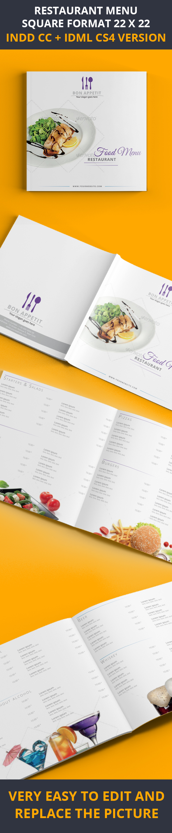
hi buddy, i think this is clean indeed but i tend to believe that you are not following one of the basic design principles indeed as the alignment of "food menu " and restaurant looks strange and the positioning of this block looks not matching with the other texts that are flagged in the middle …
the rest look tasteful and pro, about alignment, positioning and so on , i am not sure that they would not require u more effort for typo and font combinations , at least as regard to big categories …