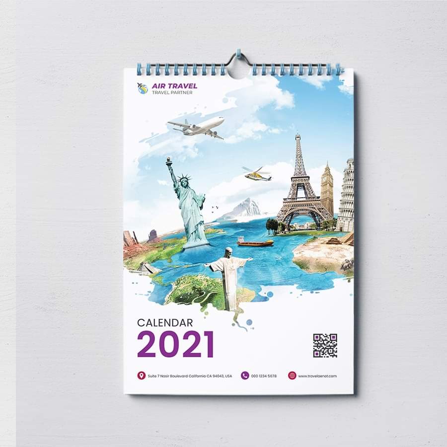
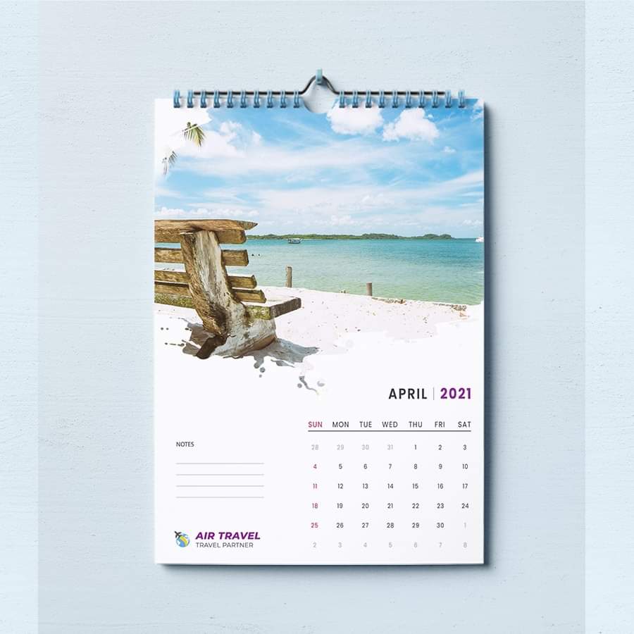
hi well as for me i kind of like it, , this is not bad, i see only sideway things to modify indeed … i have multiple observations, though … first of all the global shape that u are using to put the pictures is cool but pay attention to the sort of picture that u put inside all the same as if the design with monuments make the thing look super cool, the one with the beach is rather a problem as this is not emphasizing the limits of the shape and this is thus failing to contrast enough with the white color of the page under … pls also consider something as regard to the color of some elements. This is a template , u are expected to make the thing look harmonious in any situation so make sure not to put a violet color for the text. As this color is coming out of the blue so to speak and thus is rather likely to break the harmony rather than any other thing indeed … I also tend to feel it’s too bad that if u opt for a bit grunge watercolor shape like this to put the main pictures that this one is finding no echo whatsoever anywhere else. It does not need to be prominent , but smooth / small reminder somewhere else would not hurt in my view. If u ask me , i also tend to consider that “notes” should be aligned with “sun”, “mon”, etc … and that lines underneath should better be aligned with lines of figures the other side as well. Indeed, i can identify why u did just this but the logo could be placed better than this according to the “z-shape” reading process …
Thanks for your compliment brother. I will rectify contrast issue and alignment issue as you mentioned. I wish I will be able to think like u one day. Thanks brother again for your help. You are the best 
