Hello everybody,
There are some designs, please help me that why i received rejects.
Hi @SonkaMod
I think that bad colors this logos, too big icons, need better typography logo but you can see for example other approved on graphicriver for give idea (you don’t can copy other design in graphicriver because will hard rejected).
Good Luck.
Hi @jeriteam007,
Thank you very much for your help. I hope that I can reach the quality standards.
hi indeed , first of all, u should post rejected items one by one, open a thread for every logo the is either for people to help u … anyway at this stage u very far from standards , pls noe a collection of problems that i personally see …
1- global style
sorry to say just this but what u have right now is quite outdated in terms of style. The thing is that nowadays trendy logos use much shapes being withdrawn from others using much the pathfinder
2- concept
this is rather weak about this , no matter what the logo that we are considering …
3- typo
this is a very important part here and should be dealt as a big deal, even if text and fonts maybe changed by buyers, u are asked much an effort to bring something original, having variations and font combinations, in short something that is everything but flat , the problem is that yours is flat and not aesthetic in addition
4- weak commercial potential
well the fact of the matter is that in most cases - except the shell one - the things are pretty easy to redo and people , even if it were accepted would rather opt for redoing rather than buying to save some time …
5- imbrication
globally the way u placed texts and illustration is not convincing enough yet , things are supposed to be either connected and also breathing enough , the chicken bar one is particular revealing of the kind of problem that u have , things are too stuck and there is a lack of aesthetic in the positioning
6- lacking version
at this stage u do not have something that is required , this is horizontal version and this is strengthening the small commercial potential that u have at the moment …
Hi,
Dirty gradients. Poorly chosen color palette. The last logo uses small letters, which means that it will suit a smaller number of customers, I do not like this approach. Good ideas for logos, but I don’t think they’re perfectly constructed.
Sincerely and have a nice day!
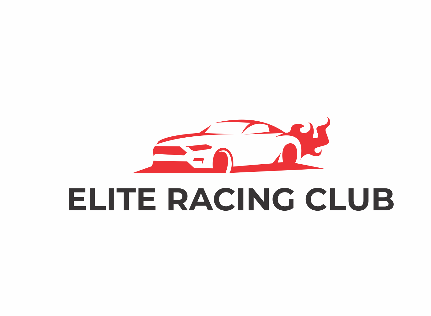
I think that your logo too large typography but you need top typography more short for example “racing club” but below typography tag line add “your tagline here” and change use other typography.
Also color icon logo need 2 or 3 more but I am not sure.
regards.
oke thanks. I will fix the font.
Hi @n2n44,
What a detailed review that you got me. Thank you very much, I am trying to avoid these problems and make really better works.
Sincerely
Hi @hellhat,
Thanks for your opinion, it is very useable for me.
good work and good luck buddy 
not a complete feedback but what u said is exact Jeri