

hi sorry to say just this but i guess it was hard rejected because your item is basically too flat in a general way. U need to introduce a more original concept, colors, originality and much creativity as regard to typo and font combinations indeed, as u have to keep in mind that there are many items already and the category is a pretty tough one
Hi, thank you very much. I got the flat option. But would you mind to tell me what can I do for type and font combinations.?
for me this is not a "flat option " there is a middle way between minimal style and really really flat like this item … think about it , basically, who would buy such an item anyways … sorry to say just this , but, quite frankly, the thing can be done in a few minutes , u have only basic geometric shapes … pls consider that a logo is worth normally around 30 $ here … so i can assure u that no one would pay for an item like this that they can quickly do by themselves … they would not save time to buy this and thus only for this matter review teams cannot let this go … pls do not consider this as an offence but an experienced designer like me can do this in less 10 minutes, for sure … u can talk about “flat” when it comes to the typo, yes, but for the rest there are a whole lot of things lacking … including originality , for instance, everything is too basic
Hi, thank you very much for your valuable time and help. I really appreciate this. I wanna show you something I have attached some logos those are approved by GR and made by another author. This is not my intention to criticize there work. I just wanna ask you what do you think about these logos. Are they not so simple and I think it will take only 5 minutes to make this logo for any experience designer. They are also basic shapes. So what do you think about these logos? thanks
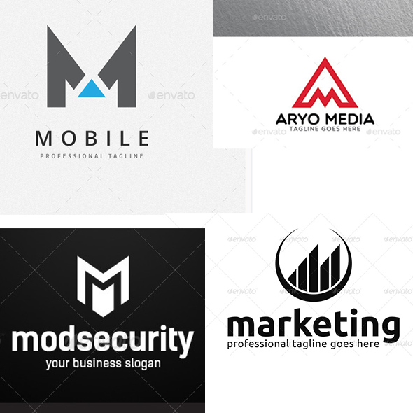
hi for me this series is way better apart from the marketing one, which is not related to the theme in my view and which is too simple, too close from your own other iten and lacking additional value
for me should forget about flat style at this stage and introduce effects, gradients and so on in an attempt to make your work look more worked out and creative too