Before I submit this I would love to hear some thoughts about this idea. If you think it should be improved in any way. Thank you

1 Like
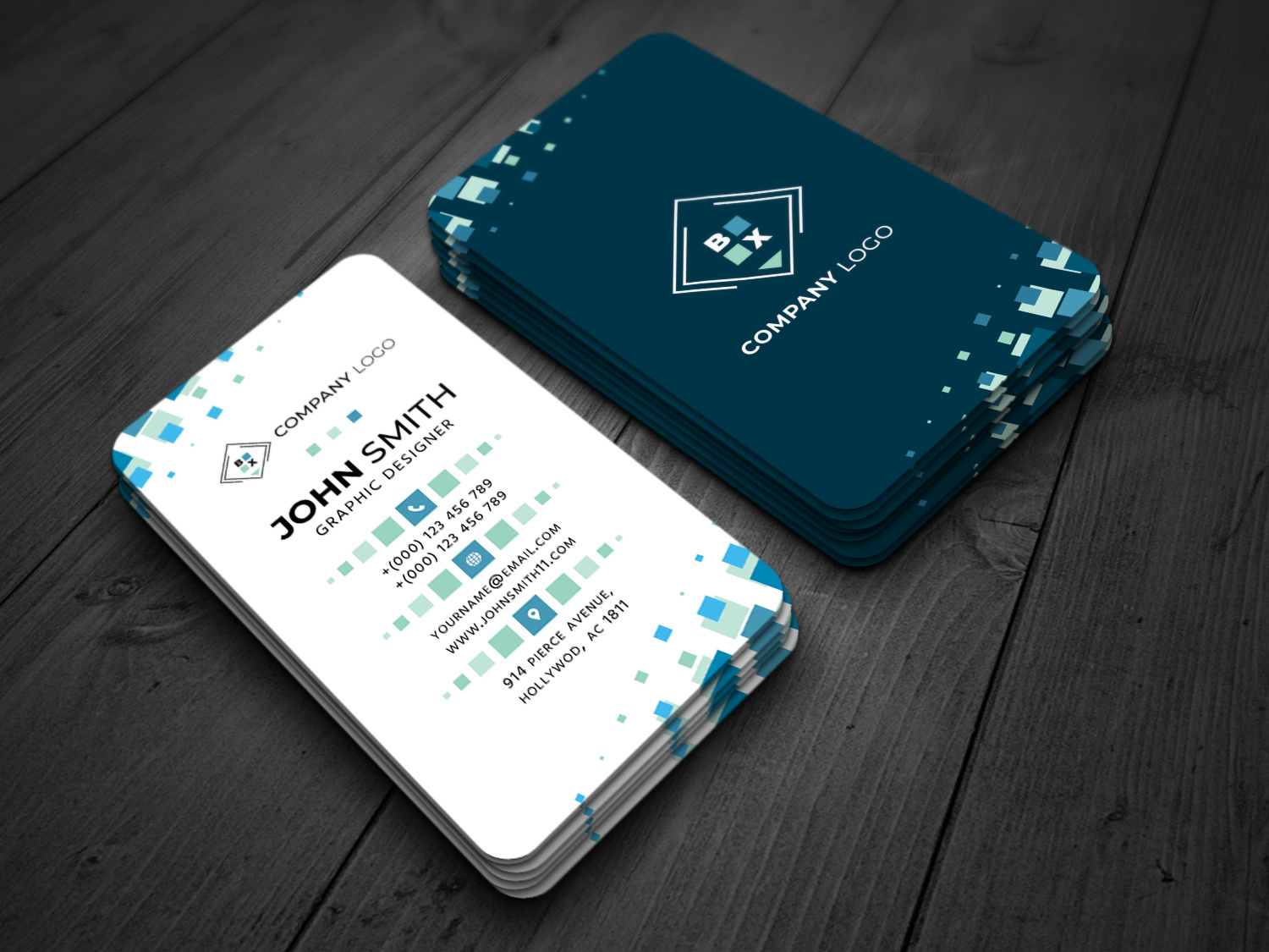
Hi,
Perhaps they need improvement:
-
Black background on the second business card, I would probably go towards dark blue
-
The logo looks very simple, perhaps you should use something more interesting
-
More color variations
-
I would add horizontal adaptation
-
The demo is worth more work
These are just my thoughts, thank you!
2 Likes
@hellhat Thank you for your opinion. This is not supposed to be The final demo, because i know, I still have to make some changes. Only a Quick save, I was curios about what you guys think about This concept. I will do this improvements that you were talking about but I’m not sure about The horizontal version if I should add
1 Like
It just seems to me that horizontal adaptation can increase reach among potential buyers, but you can do as you see fit.
1 Like
hi to be honest what u have here is interesting … but the problem is that the originality that u could bring to the table and the rather cool harmony that u achieved to set up actually are not enough to make people feel that your items are kind of flawless so to speak … here are a collection of observations that i have for u …
1- general style
for me the real issue in terms of style is that i do not see some real connection and link between the logo side and the information side … the black version gives me people a very different feeling as the other one is terms of use and looks commercially speaking a bit less interesting in my view as probably addressing a bit more of a niche so to speak … and as black color is a very secondary color in the other side u end up with a visual and style discrepancy if u wish …
2- typo
well for me this main typo is overly used and lacking a bit originality , especially as this is combined with a lack of variations and font combinati0ons indeed
3- organization
do not get me wrong , i do not mean that this is a major problem as this is rather looking good like this , but i tend to believe that u have a part of the information side that look way more empty or way more crammed because of the global disposition of all elements … u could gain a bit harmony i think if u get to find a way to make up for this …
4- fake logo
sorry but for me this is not convincing enough yet and this is not making the visual look better without if u ask me … not to mention that it makes u end up with a slight issue of hierarchy
5- hierarchy
i am conscious that the card is meant to be modified with customers won elements but u have to try , as much as possible, to make sure that u prepare things as well as it could be for them and right not the logo is lacking impact and looks almost like a secondary element, when, think about it , indeed this is a major thing as branding is part of intentions that companies turn out to have when they are providing other people with business cards …
3 Likes
hi i think that adding it would be a good idea, not necessarily turning it into a horizontal version, indeed 
2 Likes
2 Likes
1 Like
way better indeed but i am still not sure about the changing colors from one side to the other as far as the background goes, i mean …
1 Like


@LucianC
You design already was hard rejected mean you don’t can submit again but you need make other design different and submit graphicriver maybe will approved.
Good Luck.
hi buddy this is cool, though as mentioned by @jeriteam007, the thing is that u need to make sure that u have brought significant changes enough so that u do not get into trouble re-submitting again …if the previous version was not accepted, just submit somewhere else , the revised version is so very much better and may bring u sales elsewhere …
1 Like
I had submited this template one time only, and if in this state it had been rejected, there is not much I can do here. Previous versions that I’d posted în this topic were only for feedback on forum.
Thank you for your replies and time