Hi,
can some one told me why my resume got rejected because it’s not the first time that i got hard reject and i don’t know why , the resume it’s creative and clean layered organized ,Cmyk and easy to edit.
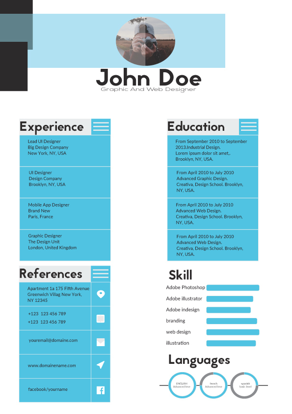
The main problems I see are
-
Alignment issues, specially the titles and the headers white space problems in between the categories
-
Typographic issues, specially the font sizes and the hierarchy
-
Geometrical balance needs to be perfect
1 Like
Hi,
thank you for your precious feedback i appreciate that.
i have some question if you don’t mind,
1 what is the best font size for resume to be easy to read
2 for the geometric balance what you suggest
thank you
Sorry but with all due respect it’s far more than just typography and balance that’s wrong here.
Everything needs overhauling from typography to alignment spacing, hierarchy.
You should take time familiarize yourself with the standards of big selling items on the marketplaces and especially the level of attention to detail that they go into.
The best option would be to start over as this is far to far from approval to spend time trying to fix, plus the concept feels a bit outdated and old fashioned as it is.
2 Likes
There’s a really wide margin in the middle of the page, leaving an empty space right in the middle. That’s a really bad idea for a composition. If you haven’t heard of the “rule of thirds”, have a read about that. It’s really handy - compositions tend to look good and have balance if they are divided up into thirds. But there needs to be balance, not just a column on the left, a big empty space in the middle, and then a column on the right.
I also agree with what charlie4282 said.
1 Like
Hi:
Your typography is not good, padding, messy, etc your need practice more for accepted sell themeforest, regards.