Today in my free time (2 hours), I created this layout inspired by the new Envato project, Unstock . Waiting for your opinions. I still think whether to continue this and publish on Behance or not . Thank you .
In the first section image changes every refresh. This helps customers to preview the image as it would look like “parallax” . Section 2 (grey section) is a slider with curators galleries .
Fonts used : Geomanist, Montserrat.
I’d avoid the vertically running text, especially the mix of vertical text and 90 degree rotated text you have where it says “Next” “Technology”. It’s confusing to the eye and breaks the general flow of the page IMHO.
Love the art direction though. Great usage of typography too. And how about them photos!
Other opinions ? Thank you ! I would be interested and what you want to contain it. Like that "In slider sidebar I want to find this and that " as a small brief. In case I continue the project. I think your opinions from this topic can help the team Envato.
Sorry for the late reply didn’t see that on my thread.
It’s hard to say what you could add to it as it’s portfolio / blog site , maybe add user’s work from behance/ dribbble / instagram using thier api , could add that to a side bar in post or have at as a footer, other than that look really good
 . Thank you .
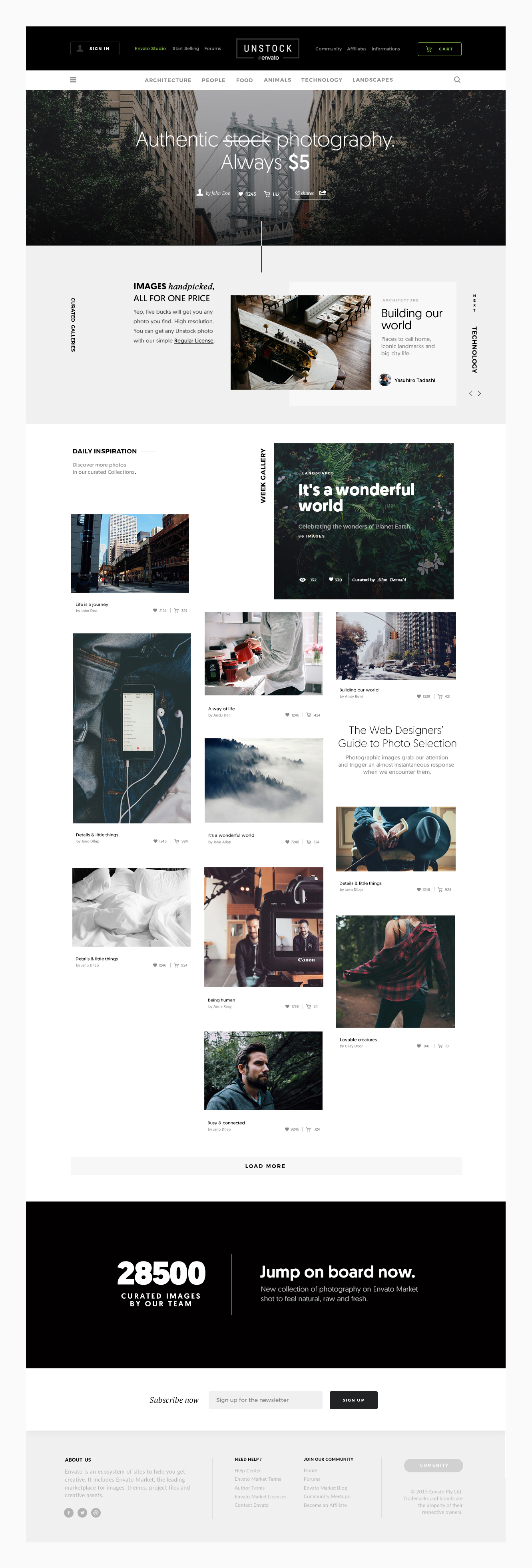


 I wish main menu could be bigger