hi to all:
please help me my flyer if is ok or error, before submit graphicriver many thanks.
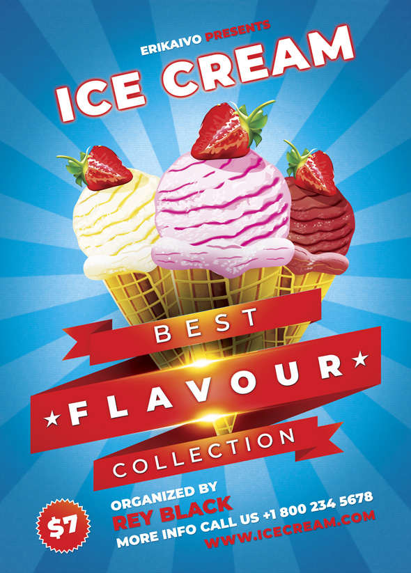
this is not too bad , this is rather punchy , though i tend to believe that header and footer slanted texts are not a good idea indeed. The texts are not flagged the same way and this is violating rules indeed. I think u should drop shadows under the titles to make things smoother. White texts are a bit lacking contrast with the background. The “best” banner is not arranged well with the set of three ice cream cones
muchas gracias voy a arreglar  saludos.
Hello there,
What software do you use to create flyers like this? Thanks for your answer
Best regards,
photoshop
Do you know maybe how much does a license for Photoshop costs? I imagine I cannot use it for free.
please write message my profile, i will help you personal many thanks.
The official subscription is not expensive https://www.adobe.com/uk/creativecloud/plans.html