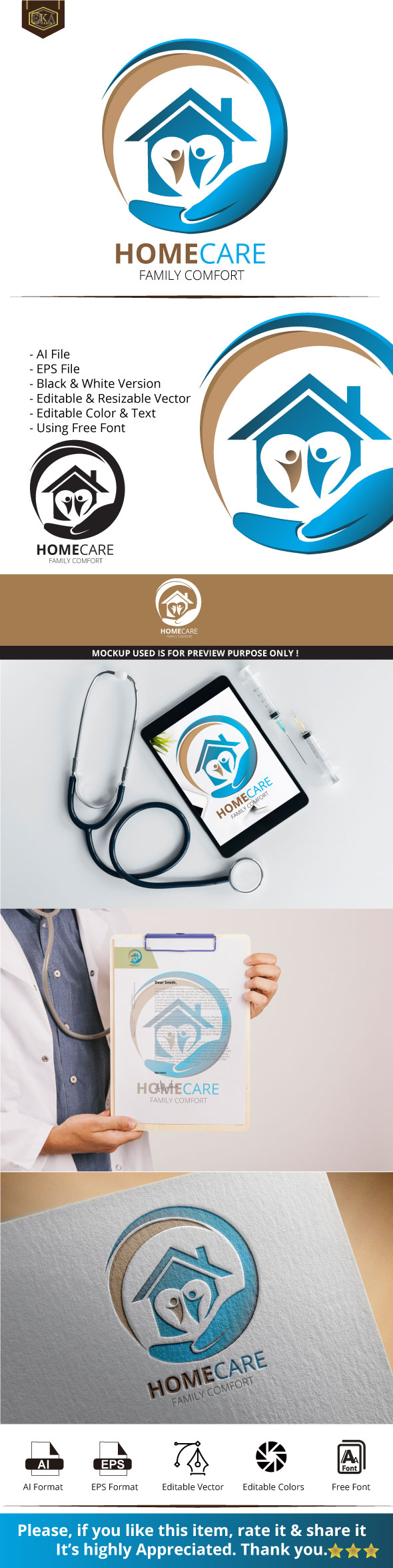
hi indeed, u have many things to fix or improve indeed …
here is what i think 
1- general style
indeed, as for i know, for here your logo has too many details inside … the thing is that they are considering the logo in a small size and the the more detailed the logo turned out to be and the less good looking he may be looking at the same time …
2- colors
i think that u should think about complementary colors , at this stage what u have is neither very punchy nor very aesthetic visually speaking, it would be more efficient to have either complementary colors being associated or to have variations on the same color
3- typo
this is definitely super common what u currently have, for here not only do u need to introduce some originality in the typo somehow some way but u will also need to combine fonts more , too
4- execution
sorry to say just this , as not doubt that u did your best but for me, the hand in particular does not look strongly executed enough
5- horizontal version
this is required and it looks like that u do not have this … the logo category is probably the only category in which missing technical requirements are leading to hard rejections , so think about adding it … besides as regard to the general shape and so on of what u have done, i am a concerned about u managing to imbricate the logo in a horizontal version
6- tagline
i think that u should turn the tagline into a slightly bolder version as there is much of a discrepancy right now, probably too much all the same between the name and the tagline