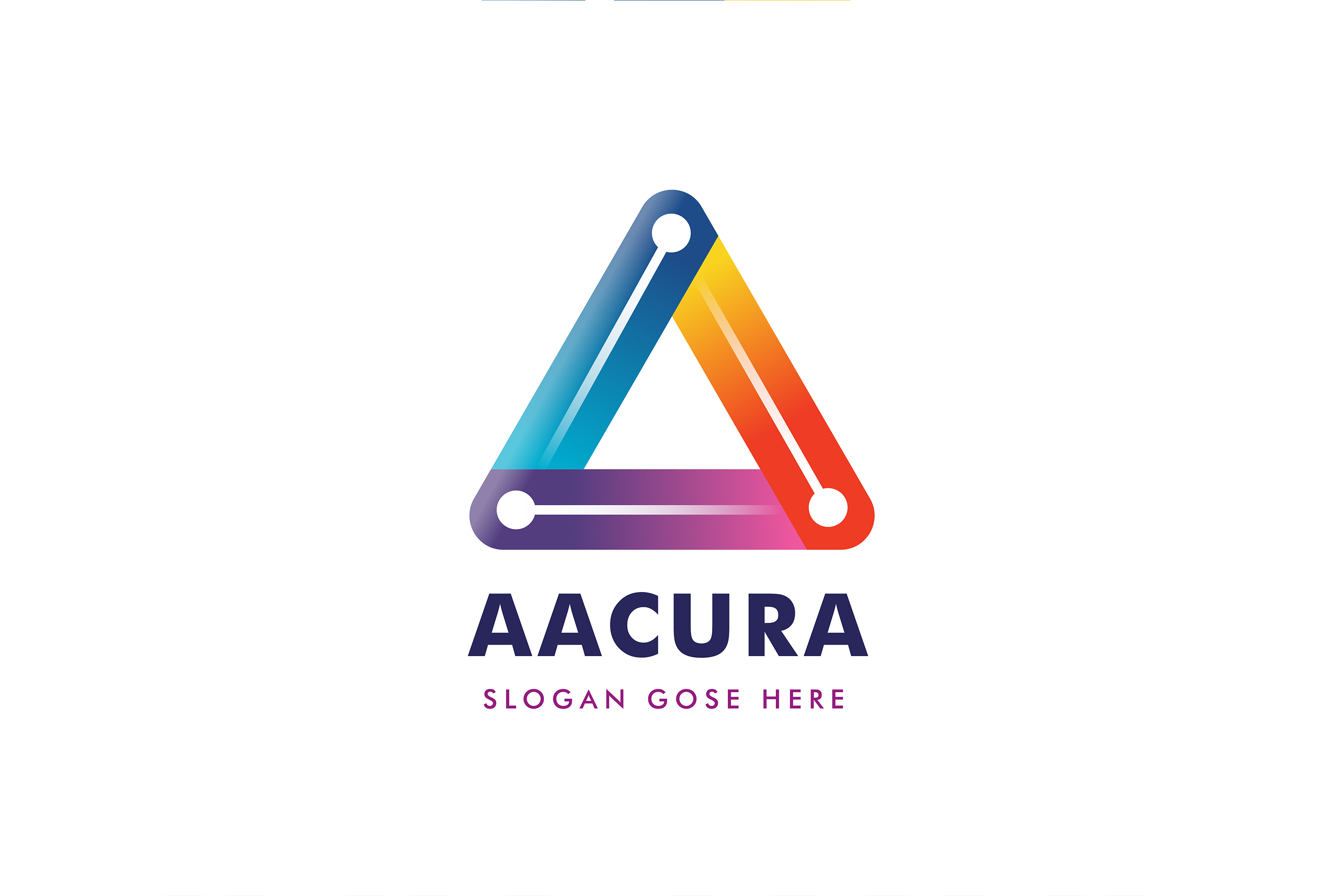
this is my design please guide me, then iwill make my next logo under the rules


this is my uploaded preview file
thumbnail

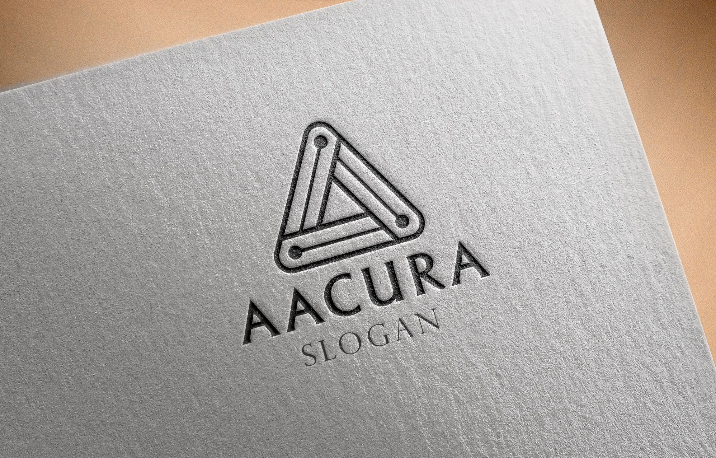
this is my design please guide me, then iwill make my next logo under the rules
this is my uploaded preview file
thumbnail
The text isn’t aligned with the graphic for starters!
hi indeed @SpaceStockFootage was right about what he said though for me the real reason for the rejection is the typo … the tagline is too thin and , if u ask me , is clearly not matching with the name … the combo is not working … beautiful logo otherwise …
as for me i was only thinking about changing the tag line font … i think that , as such , this is flatter now … u just need to go back to the previous version and find a font matching with the title for the tag line …
Still not aligned!
ok
please check this alignment and font if my font is not so good so can you please suggest me some fonts foe my design. thank you
Perfect alignment! Keep in mind that it’s ‘goes here’ not ‘gose here’.
OH  …SORRY FOR THIS …BTW THANK YOU SO MUCH
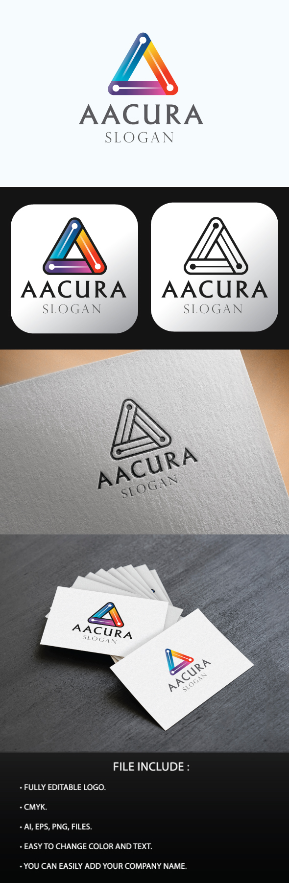
this is globally better even if the originality is not super high in the font combination and i personally liked more when u had a more colorful tag line indeed …