Hi,
Please tell me why my “+25 Modern Social Network Icons” has been rejected?
Thanks
With the respect there are several issues:
-
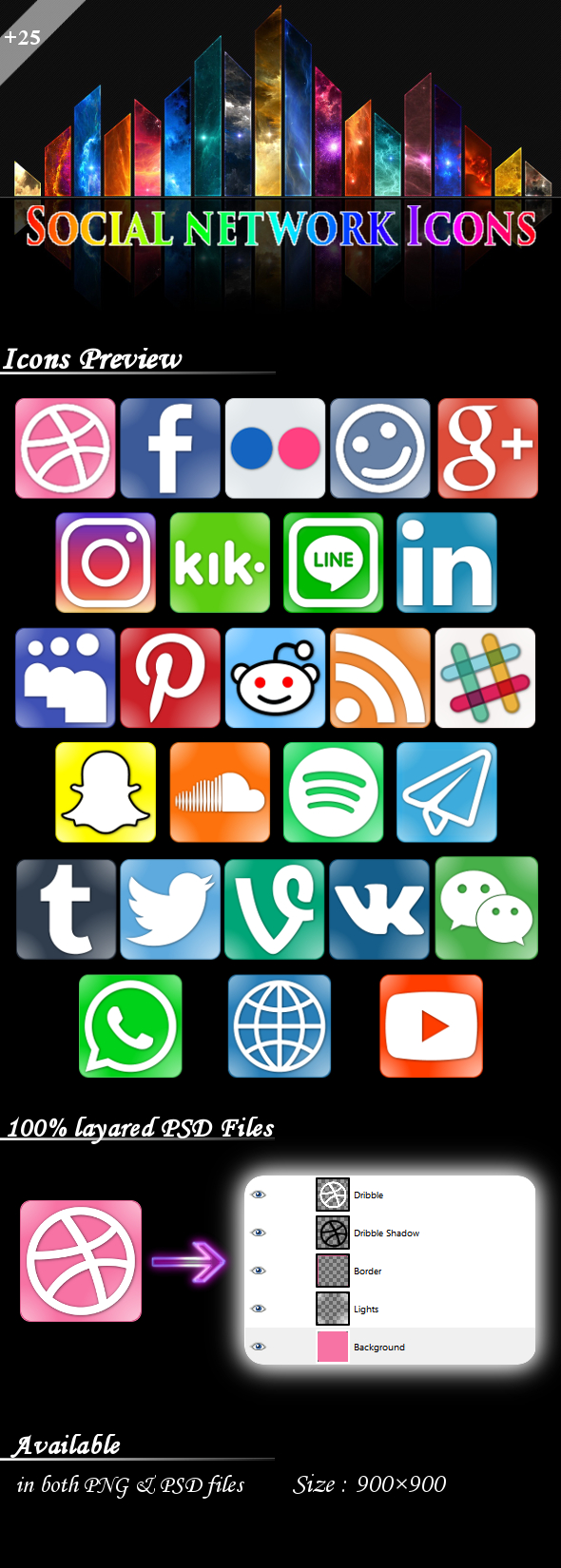
the preview image itself, even hough it’s not technically part of the icons does not look good and immediately puts the item in a poor light. e.g. “social network icons” is pixelated, the coloured blocks in the header don’t really make sense, layout and spacing of the icons themselves are all over the place, titles typography should be another font etc.
-
the icons themselves are very close to the edges of the backgrounds and feel a bit oversized and need more padding to breath etc.
-
there is not really anything esp. unique or premium to the concept
-
you would prob need multiple variations rather than just one creative angle esp if it is quite simple with just the corner effects
1 Like
Only Social Media Icons in an icon pack are not allowed, see here: