I am new on graphic design, My first 3 logo got rejected, please see my every logos and talking about The Logo Shape, Tagline and slogan part and Color combination. It will very helpful to me that you advice. If you pointed the problem i will never mistake again. I read many reject related post and see all you are explain very well.
First one is dental logo, just simple clean and many color variation.
i think may be have any technical problem ? i upload it with main file plz check the main file just a minute ( i can’t upload here). I make dental shape with pen tool and shape not expanded because when it expand it convert stroke to fill than customer can,t increase and decrease the shape weight easily and editing color.
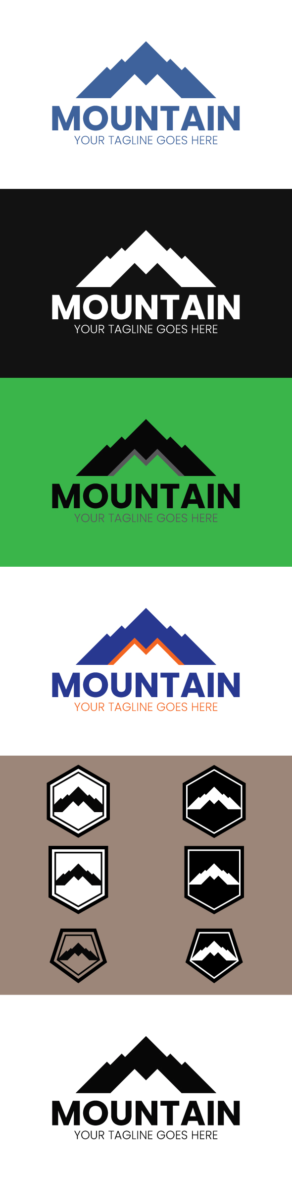
The third one is Mountain logo design also it can be use as a Mountain letter M logo, that is Clean and simple, and i think it’s very nice shape! what your opinion about this ? and please say about tagline slogan of the mountain logo.
hi well indeed, everything is too naive and raw at this stage, u need to put more graphic effort in all your tries , work more on typo, make it more unique and solid and try to improve your illustration skills indeed. u have to be aware that this category probably the toughest one of all and that u will to bring ultra professional work to the table so that u have anythign accepted indeed
well for me u have a problem of style in the first place, pls do not take this personally, i am sure that u did your best to bring these logos to the table , but the thing is that it looks a little bit clipart-like … this is definitely not in the trending style that envato is looking for. Today’s trends are more likely to have a shape withdrawn from another one … here u are also expected to have a very serious typo work , to bring not only font combinations but also some originality through the fonts that u are pairing . For me u should opt for illustrations that look more “abstract” they will not only look modern and better looking but they will also have a much better commercial potential as well
to get into deeper details, well for teh first logo , the shape is definitely not “even enough” it makes your logo get into sort of a naive or childish style when a logo for dental things should mostly inspire seriousness and professionalism … the main font is not working if u ask me and same goes with the one of the tagling, besides , talking about teh tagline, the proportion is not good and the interletter space has to be modified … it makes the tagling look really not good
for teh second logo, sport cars, indeed ,u are stuck in between an abstract style and a drawn style and as such u get into a clipart style for me colors are not necssarily well chosen , i mean at least for the one on black BG …
the third one has a bit of retro style in my view, that might be an angle but the problem is that, like this is done, it looks like u did out of control … the typo is too flat in my view to be able to make here as for i know …