This was my first time submitting a font. It was rejected. I have screen shots below. Can anyone give some CONSTRUCTIVE criticism, so I can improve and get my next ones accepted?
Thanks.


This was my first time submitting a font. It was rejected. I have screen shots below. Can anyone give some CONSTRUCTIVE criticism, so I can improve and get my next ones accepted?
Thanks.
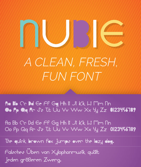
hi as for me u have different issues indeed, the first of them all is that it looks like that your font is meant to be for titles only … difficult to imagine writing a whole paragraph with this font … it would be unreadable indeed, plus u have a problem of presentation, like this it looks super compact and teh smaller it gets , the worst it gets …this is pushing people to have a bad feeling about your item, not to mention that your font is not centered in some of the squares , which does not look professional in a way …
Maybe you could also work on cleaning up the preview images to make it more appealing.
Hello Leigh,
I personnally feel that this font requires more work on the actual letter forms and construction without talking about preview images.
Typogama (Michael), thank you so much for the time you took to write that. It was very constructive and very helpful.
Thanks to n2n44 and gonjetso. I will take everything into consideration, as I keep trying to improve.
Thanks again, All.
L
as for me i am not expert in font designing but i think that the combination of things that have been told will definitely help u to take your product to the next level