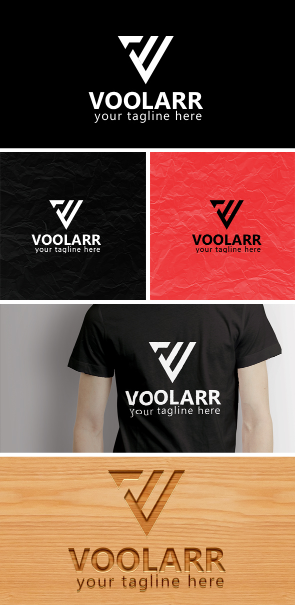

The typography doesn’t look good. Font choice and spacing look quite bad. I quite like the V design, not sure if the concept is strong enough though.Overall it’s a bit simple though.
Is there a faint line on the middle downward stroke of the logomark for a reason? It looks like a mistake, especially on the 3D wood mockup where it has a very faint shadow. The word VOOLARR - the kerning on the letters needs looking at, and possibly even a different font or a lighter weight of what you have used. Just looks to heavy.
The space between VOOLAR and the strapline is to tight and needs opening a lot.
Hope this helps.