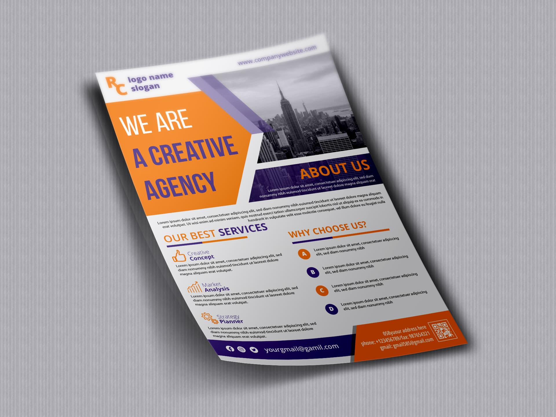
With respect it’s a long way off the standard.
there are numerous issues especially with the typography, spacing and hierarchy in particular
Just some (not finite) issues:
- line height in the main title is not good
- the intro copy below about is very squashed together with the services
- the font choices and weight needs rethinking
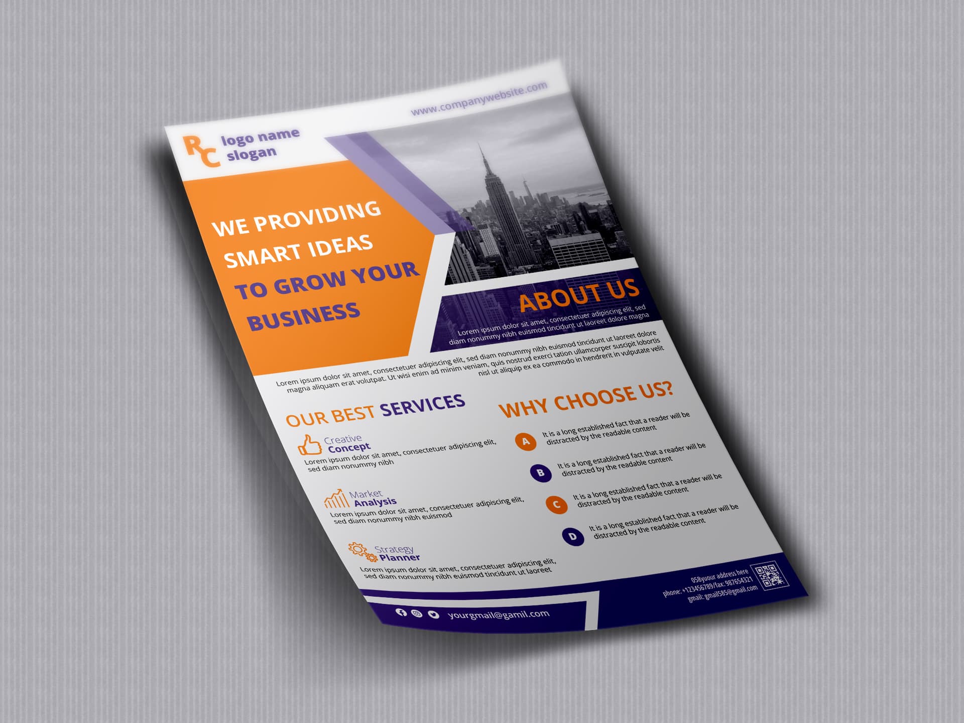
Almost all the same problems still exist.
Users like @DesignSomething or @n2n44 etc. are better placed to comment on the technical side of the design but you need to invest time refining your understanding and experience of the basics otherwise you are going to face the same problem every time.
At this stage it is very hard for you to understand the issues because you don’t undestand the design basics. You need to learn and practice few years about concept, typography, hierarchy, readability, composition, layout integration, color theory then combine all of above with the latest trends in design.
Until then it is nearly impossible for you to get approved.
2 Likes
You also need to be careful about how much ‘inspiration’ comes from Free templates available elsewhere. As @DesignSomething said if you do not have a grasp of the basics then applying these to original work or adapting other designs will be impossible.
1 Like