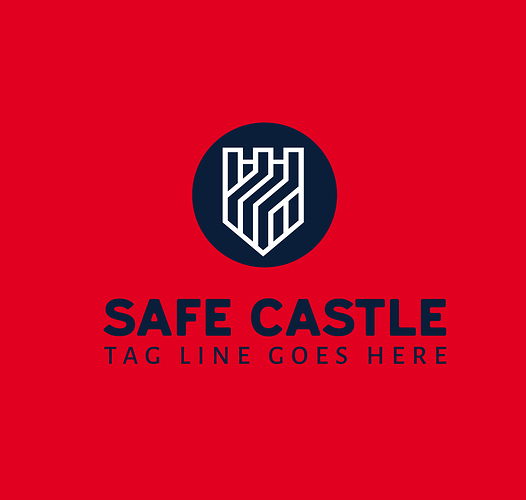
what’s wrong with my logo? i don’t understand why graphicriver rejected this logo. do you help me with this ?
thanks
hi indeed i rather like it but i see a few small things. first of all u have a real issue about the choice of colors which is resulting in a lack of contrast and thus of readability , which prevents your logo from looking outstanding and somehow some way from looking attractive but this is really to fix, just pick some contrasting colors for text elements and this is it …
then the typo is clean but lacking originality a bit and also slightly failing to combine fonts enough
finally and not least , as for we can see here u have no horizontal version when this is required … pls keep in mind that the logo category seems to be the only category in which u can be hard rejected for technical reasons …

