I designed the landing page of a marketplace for Metaverse NFT sales and forwarded it to Envato Market, but it was rejected, and there was not enough explanation, I don’t know what to fix.
What do you think is the problem?
I designed the landing page of a marketplace for Metaverse NFT sales and forwarded it to Envato Market, but it was rejected, and there was not enough explanation, I don’t know what to fix.
What do you think is the problem?
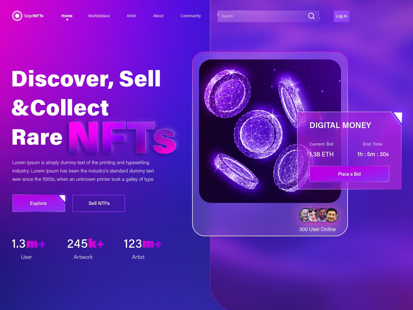
hi, for me this is because u have a variety of weak points here … mainly as far as contrast and hierarchy go. Indeed, the contrast is far from being great almost all over the design and , as this is always what happens with such a contrast issue, there are lots of consequences in a snowball effect, when it comes to exposure, hierarchy of information and readability. Look, a very good example to illustrate just this, the word “NFT” that u seemed to be willing to emphasize actually ends up being far less popping out that way smaller texts contrasting more. Also what is meant to be call for action buttons are either too flat , or not contrasting enough and in the end, definitely not “selling” enough. I would also add that , spacing is not completely coherent all the way , also due to the varying size of word “NFT”, which makes this part look not properly arranged. Finally, some extra decoration would have been welcome , if u ask me, like shadows under the window in which coins are showed for instance
thanks mate, it was very informative
Your design is good but I not like colors as contrast, you can change color for example yellow or other color as you wish “NFTS”, also background “digital money”, m+, k+ etc you can change other color, not need use shadow in typography.