It is not like this is my first time uploading a book cover on GR. Everything is named and layered in order for easy use. But getting a rejection without something that tells you why it is rejected it’s absurd.
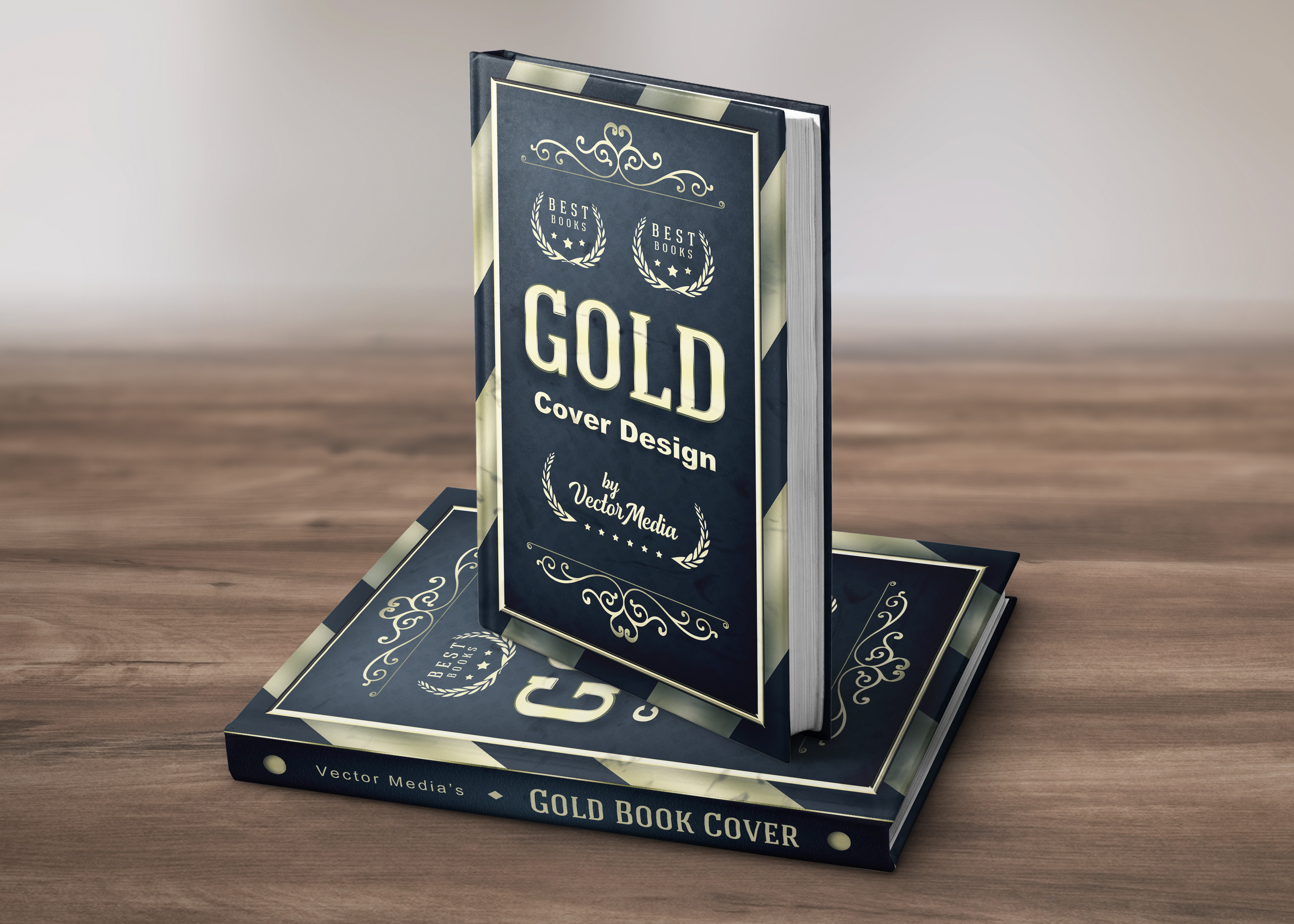

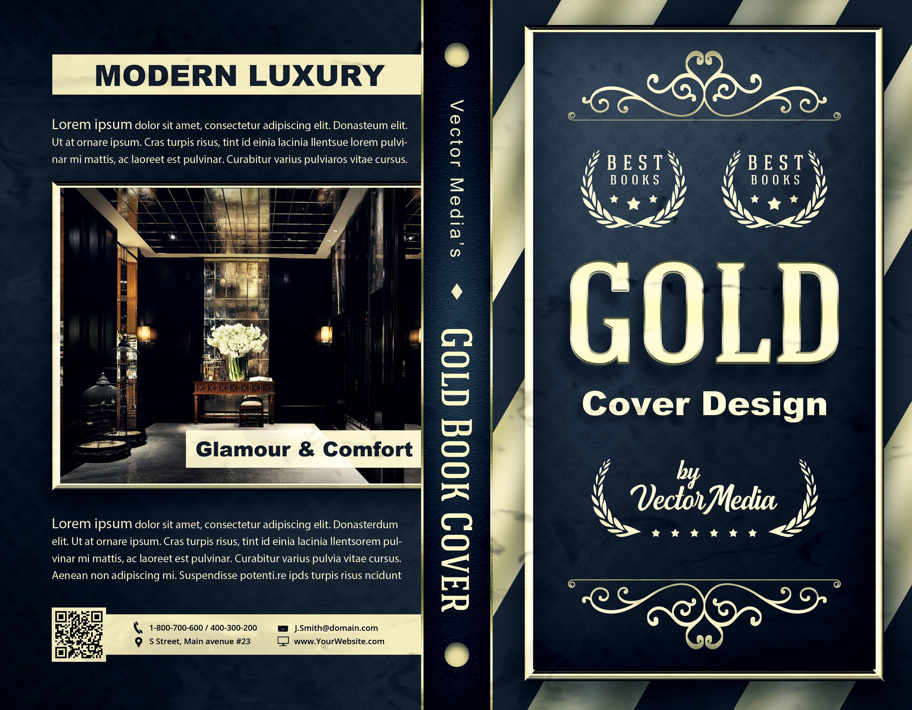
Your cover doesn’t have any concept. Composition is flat. Elements are not related.
Can you elaborate a little please ?
Elements you used looks like random elements used together. Ususaly centered compositions are static. Use dynamic compositions and play with negative space. A cover needs to attract to intrigue. Your cover being static doesn’t makes me to grab the book. Also try to chose a niche like romance, science fiction, adventure etc and treat the design accordingly.
Appreciate the response.
‘random elements’, I see… how though ? In what way ? Do you mean because the oblique lines from the front page are not connecting in the back page design ? So that would make you think it’s a ‘random’ composition ? Because I’ve chose it to look this way and don’t really consider it to be random.
“Your cover being static doesn’t makes me to grab the book”. So would you say it’s way too organized by static ? Everything being aligned in the center of the frame ? But who is there to say that is ‘wrong’ way to go about it ? Don’t people have different taste ? For some maybe this would be something they are in need of, but not being able to see the reasoning for not even being allowed on the market is confusing.
Check this link and then compare with your cover.
i personally both agree and disagree with what @DesignSomething said. I usually agree with him in almost all cases but here, i do not feel completely the same as i would rather say that the item may be more suitable for the dvd cover section rather than the book cover one, most importantly … for me, u have several issues to fix also to take your item to the next level. The first one is regarding the global style. Indeed, if u ask me , the elements are a bit too bit and it turns out not to fit completely the “refinement” that u are pursueing with such a luxury theme indeed … in addition the cover is definitely more attractive than the other side and this side is empahsziign what i told u when it comes to having too big things to match the style u are expecting to “give birth to”. The two bullets are in particular really too raw as such , luxury is not transpiring from these elements … the picture that u used is also a bit too dark , this is not valuing your item and the set of icons u have here is too simple and as cut does not really bring anything to the table in a way …