Hi, Please can you help reason for this flyer’s hard rejection. I tried to make it look simple and unique , i think it doesn’t look too bad for hard rejection. what do you think please.
Hello,
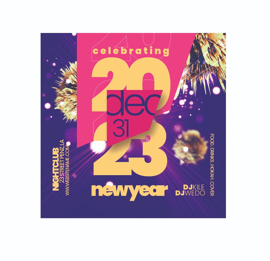
I think the rejection is due to poor typography readability. Notice the text like “newyear” where the “a” and “r” merge into one. Similarly, “NIGHTCLUB”.
2023 is covered by a shape with the word “dec” that looks like “deo”.
The background graphic could also be different.
Overall, an interesting idea, but it needs refinement.
I hope I helped ![]()
Good luck ![]()

Thanks you for taking out time and providing feedback ![]()