Hey @JeriTeam I think the font small size is also the reason for hard rejection i also got same problem in two PSD templates recently
1 Like
I use 15px font “arimo” on google
But its too small to read I think you can use 18px font
1 Like
You can’t editing once it’s in the queue. You will have to wait and see what the reviews says.
Again I’m not a reviewer but I would expect a PSD to have a lot more to it and it needs to be pixel perfect in design which with all due respect this is not.
That’s why the screenshots look strange - they could be tightened up but they seem to be a completely different standard and style to the rest of the design
1 Like
Thanksss I understand, last question, my fonts is too small or not?
Thanks but if rejected I will make other design new use other fonts like lato 
Hey @charlie4282 Could you please check these designs and let me know what are the reasons that these got hard rejected.
Your feedback is greatly appreciated.
http://premium-themes.co/rippy/01_home_desktop_slide1.jpg
http://premium-themes.co/rippy/02_home_desktop_slide2.jpg
http://premium-themes.co/rippy/03_home_desktop_slide3.jpg
Many thanks in advance
I upload my other design psd is

I don’t think they are necessarily too small - stuff like that is less important. The issue is the typography generally is not very good - typography is not just font choices and sizes, there is more to it with hierarchy, line heights, spacing, styling etc.
Unless you are 110% sure the screenshots from behance are licensed to be used commercially (which seems unlikely) then they need to go.
Aside from potential legal implications if not, they are obviously from somewhere else which 1) means there is even less to the core design and 2) looks like you were unable to do it originally. Either way it doesn’t help
2 Likes
It’s actually not bad.
Colours etc are nice and typography is not far off (some body copy on services could be better).
Not a fan of those counters - the text looks slight mis aligned and too close to the numbers plus needs more padding top and bottom of each service.
You could try creating a multi page version too to add to the features. One page PSDs will always be a tough market as they are limited in what there will be to them
Thank you @charlie4282 for your valuable feedback it make sense to me, But as you can see its not a very bad or miss aligned then could you please let me know why its hard rejected?
I can definitely do a mulipage template. But you know i will have to wait around 25 days from reviewer team.
Do you think this design could be a soft reject from reviewer?
Thanks,
It could be but one thing to remember with PSD is that it’s assumed to be an easier category (like email) when in actual fact it’s harder because there is no room for error.
Your design is not too bad but there are a ton of files like it and in that style out there which will add to the challenge
ok @charlie4282 Thanks for your feedback and suggestions but lets suppose i will make a new PSD template for multiple pages and will resubmit also i found that my designs are below on 1920px and most of other designs are submitted by other users are on 1920px resolution.
If you feel that there is any other reason as well that i should have to take care please let me know your way of catching the design is supperbb i greatly appreciate this.
Thanks once again.
You just need to “cover all bases” the issue is that all reviews are subjective too.
The general rule is that if you focus on originality (with Purpose and not just stupidly random!) then that helps - it’s usually quality over quantity and I know that it doesn’t help to try to create a million features that bear no benefit or role in a design and are simply an author shoehorning somethings for the sake of adding something else.
In my view (again not a reviewer) you have an excellent building block that just needs refining - a multi page version will definitely help but appreciate the hesitation when the queues are big.
@charlie4282 I appreciate the opinion of my work I need to know because there is no help from him agradecere will correct me to move forward in advance thanks
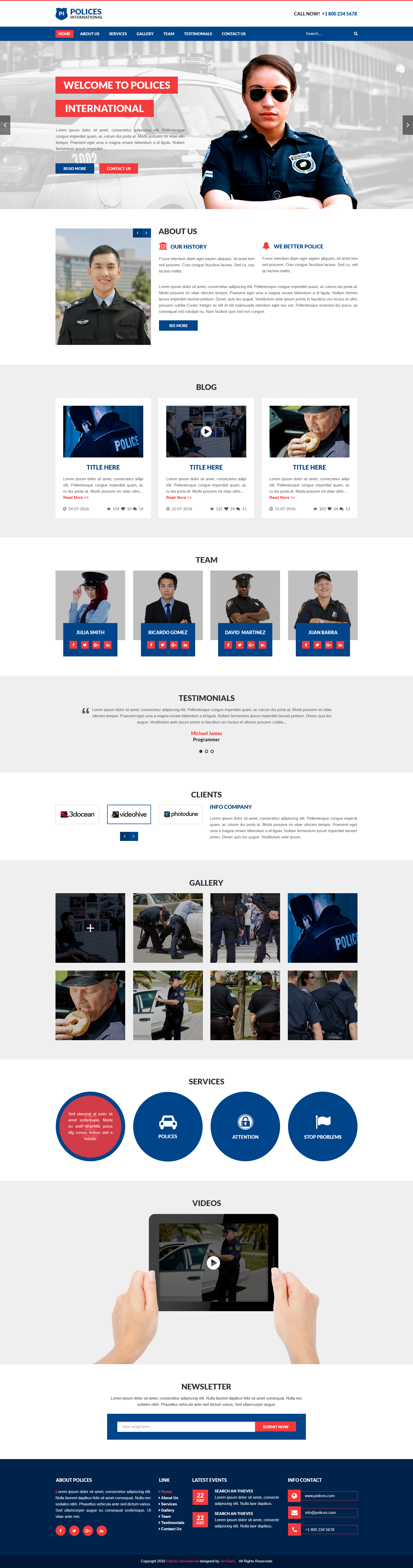
This one is better than the other one but:
-
There are still fundamental basic design flaws with typography and structure
-
It is not pixel perfect enough nor offers enough originality or premium quality for a PSD here
-
The sections make no sense - police organizations don;t have ‘clients’ nor ‘services’ in the sense that they are displayed like a design agency
1 Like
Many thanks, now yes I understand you regards.