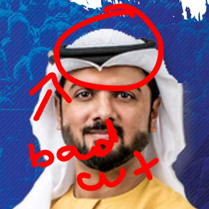
After hard rejection, I have worked on this flyer. Need suggestions… Is it okay or not? Should I upload it or need more work. Please ignore the bad cutout person picture I have just placed it as sample… I will place a good cutout picture in the final preview. Thanks
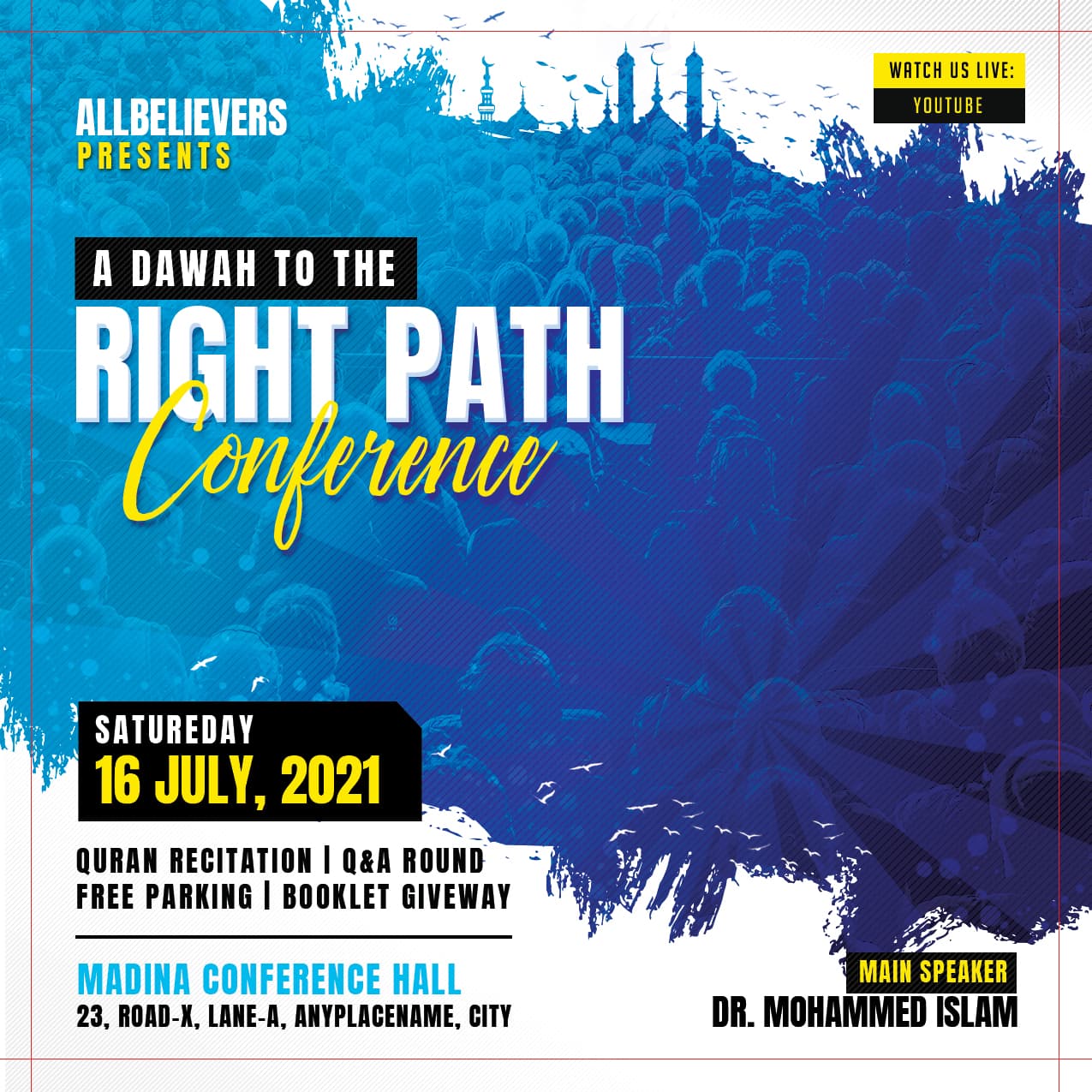
Updated Version:
Previous version:
1 Like
Hello…
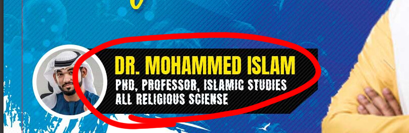
very sorry… your bad cut a people
Maybe error text like wave white
Your need better design more quality graphicriver will to approved…
Regards.
1 Like
Thanks, but the cutout image is just placed to give an idea only. I didn’t work on it at all… It will not go with the template file. I corrected the problem of the white text…
1 Like
Long way off the standard
-
Poorly cut out assets - it may be just to give an idea but not doing it properly is lazy and suggests that you do not know what you are doing, which will get rejected
-
Take out the assets you cannot share like the man and the background and there is nothing much left except some text
-
Typography is weak
-
Hierarchy is confused
-
Too much information for a post/design of this size
-
Social icons too small
2 Likes
@JeriTeam @charlie4282 How is it now???
Take out the assets you cannot share like the man and the background and there is nothing much left except some text
without the assets, it will look like this…
the background image will be added with the template
Thank you