soft reject comments are not helpful

Soft rejected second time, unfortunately comments are vague, subjective and not helpful.

What can I do? I just need them to clarify issues for me, but review process is so one sided, rigged to have little or no back and forth communication.

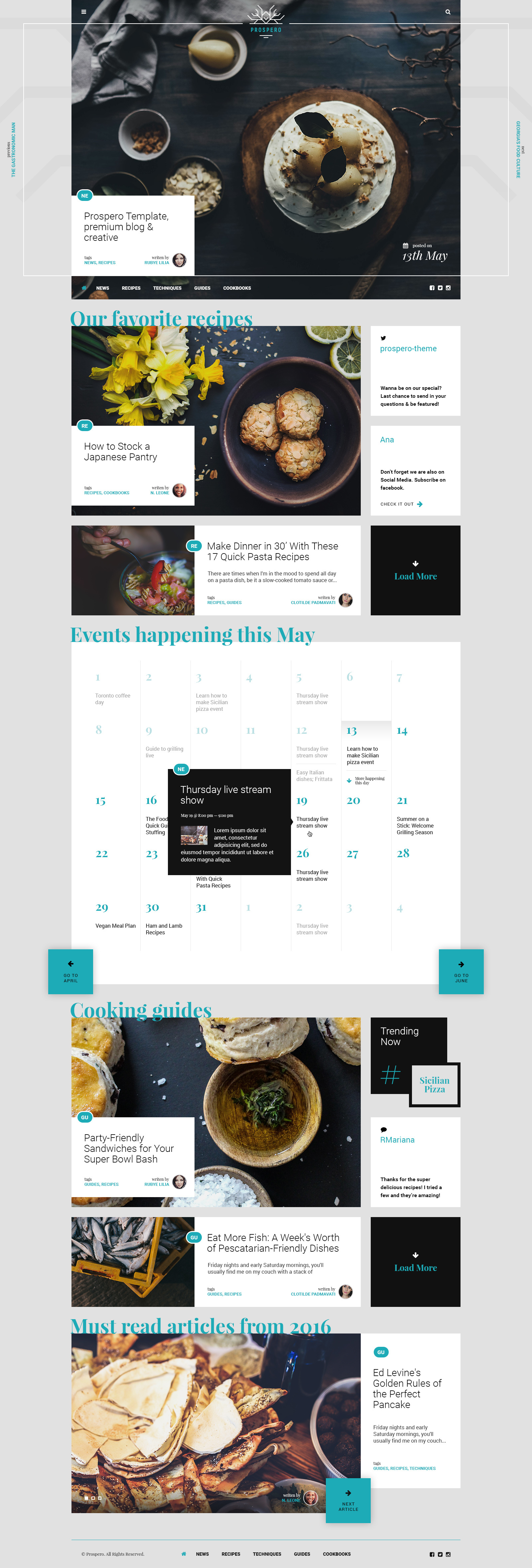
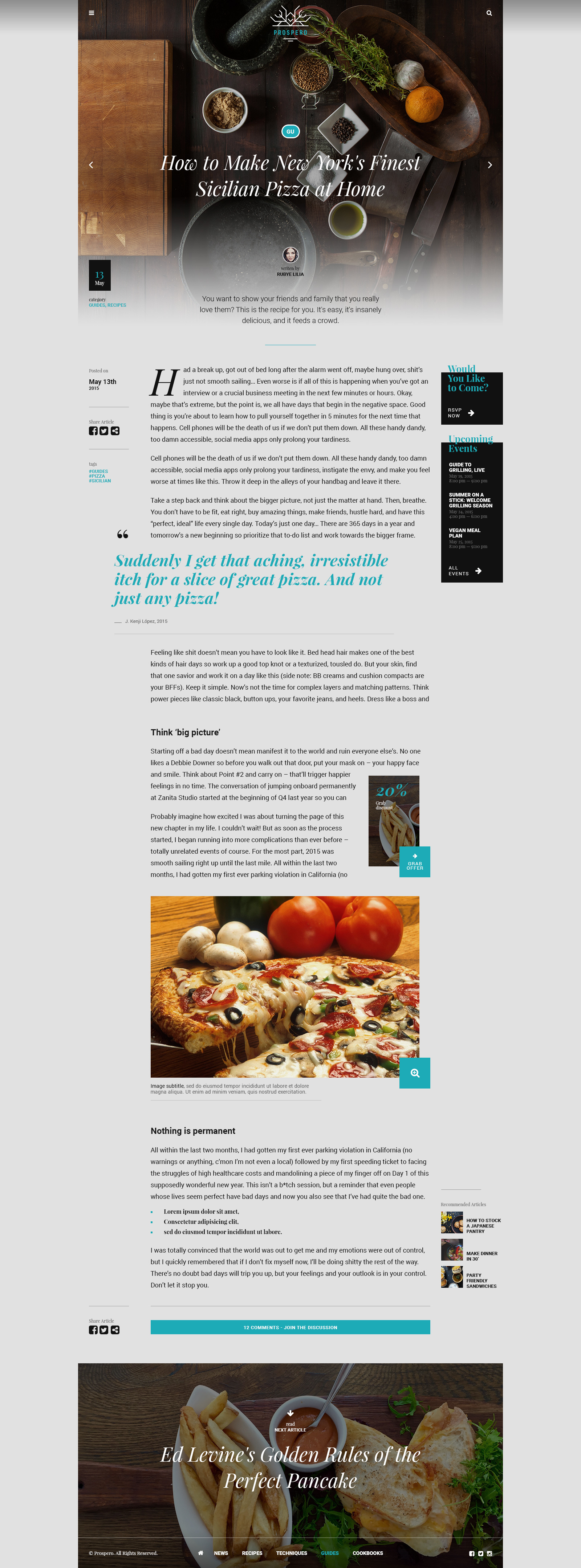
  1. COLOR USAGE: The design needs improvements in color usage. Although you may feel this is a subjective topic, it is quite objective and relevant to core design principals and will affect the file’s overall appeal. The use of one color across so many elements creates a somewhat “flat” appearance and reduces overall visual hierarchy.
  2. SPACING AND ALIGNMENT: There are spacing and alignment issues in this item. Please make sure that all elements are aligned properly and spacing is consistent from section to section. Here are some articles with more information regarding negative space and proper spacing: http://webdesign.tutsplus.com/articles/using-white-space-or-negative-space-in-your-designs--webdesign-3401, http://webdesign.tutsplus.com/articles/adding-space-to-your-designs--webdesign-14836
  3. READABILITY: Parts of your design are either difficult to read or have contrast issues. Please make sure all sections of your design have adequate contrast and all text is easily readable on all devices.

Second reject:

Unfortunately, the changes are not enough and the previous review still stands. Please carefully check your item to make sure all problems were adequately addressed before resubmitting this item. Delete the images from the main file and replace with placeholders. http://placehold.it

:frowning:


Copy and paste your rejection message and your item so the community can give you an opinion. :slight_smile:

1 Like

p.s. I tried to get communities opinion on this before, but I didn’t get much :wink:

I added details to OP.

and as usual community doesn’t want to help :frowning:

Is it PSD?

yes it is PSD category, any tips?

It’s not that the community doesn’t want to help. That’s very offensive. But, what help can we give you?

Page

  • Line Height to Font Ratio looks weird.
  • Background color feels old
  • The share articles look out of place
  • Tags are too close to one another. Clicking will be very hard
  • Upcoming events contrast is out of balance
  • " Feeling Like s$#@" really isn’t good text to have in something you sell :slight_smile:
  • Image subtitle has no contrast color and the text looks out of place plus line height
  • Images are huge, comment buttons look so small
  • why isn’t the footer full width?!
  • why is the hamburger menu icon and search icon so far away? Is this mobile only?!
  • Written by is very small, I only saw it on the second pass
  • logo looks too small

Page

This looks quite good except for the things that match the first page as well.

Page

  • old background color
  • too much contrast
  • headings look weird
  • your logo is on the background, can others work? think of something universal
  • about us is black, veliit esse is blue … hmm?

This is why no one is stepping in. It needs so much work I would start all over again. It needs fine tuning everywhere mate.

Good luck! :slight_smile:

2 Likes

Thanks for taking time to respond. What about reviewers point #1 ?
Your suggestions would work for 2 and 3 yes.

Just change the “blue” color to “some gray”