I received an email saying my social media template isn’t at the quality standard required to move forward. I want to know what the problem is with my design. I also uploaded flyers and they got hard rejected.
Could somebody please help?


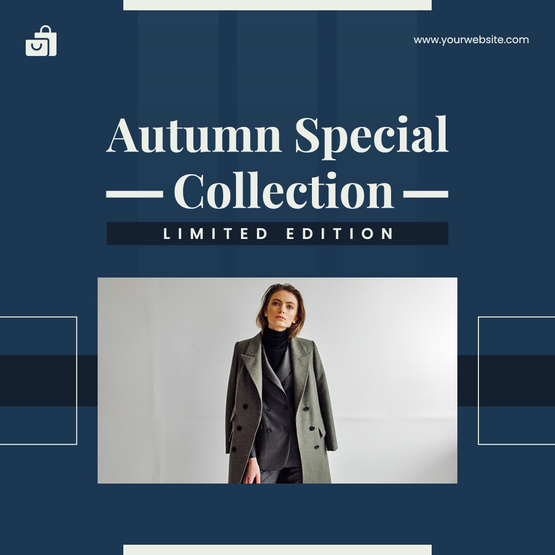

With respect there’s a consistent issue with design basics in all of them esp with hierarchy and typography, plus if you take out the hero images/assets then there is not much left to the designs, but in particular:
-
Typography does not work, there is far too much text for a social post, margins around copy are inconsistent, plus there is no real ‘design’ to this that could not be done in minutes
-
Very basic, and typography could be improved
-
As with first one - too much copy, outside margins are inconsistent, and the shapes top and bottom feel quite random
-
Is the best of the bunch but the hierarchy between the title and the smaller image needs to be handled carefully
-
Construction is messy and a lot going on without much obvious value to elements like the line
1 Like